Media Kit

Description

Used for logo sets and downloadable media kits.

Available in zones:

  • Zone A

Permissions:

  • Available to all content editors

When to use it

Usually when you use the 'insert from media' button and select an image, T4 will default to inserting the image itself into your content item. But if you want to - instead - provide your users with a link to download the images rather than (or in addition to) displaying them, then the Media Kit is a great content type to meet this need.

This is especially useful in cases where you want to share image files like templates, logos, flyers, posters, desktop or mobile wallpaper files, etc. especially if you want/need to provide multiple file types (.JPG, .PNG, .EPS, etc.) or different variations of the same image for different purposes.

How to use it

Navigate to the section where you wish to add the media kit content item. Click "Create content" then select either the "Media Kit" content type.

Screen shot of Media Kit content type

Required fields

  • Name
    • The text in this field is for internal, informational purposes only, and appears in the list of 'content in this section.'
  • Media Item Name
    • The text in this field becomes the heading/title in the black box above the image and is meant to be the name/description of the image. 
  • Image
    • In this field, you will select an image to show your users so they know what image they're downloading if they click any of the download links below the image.
  • Media Download 1 Name
    • This field is the download link text. You should include what file type it is and the purpose or use of that file type.
  • Media Download 1 File
    • This field you will navigate to the Media Library to select the file you want your users to download when they click the link.

Optional fields

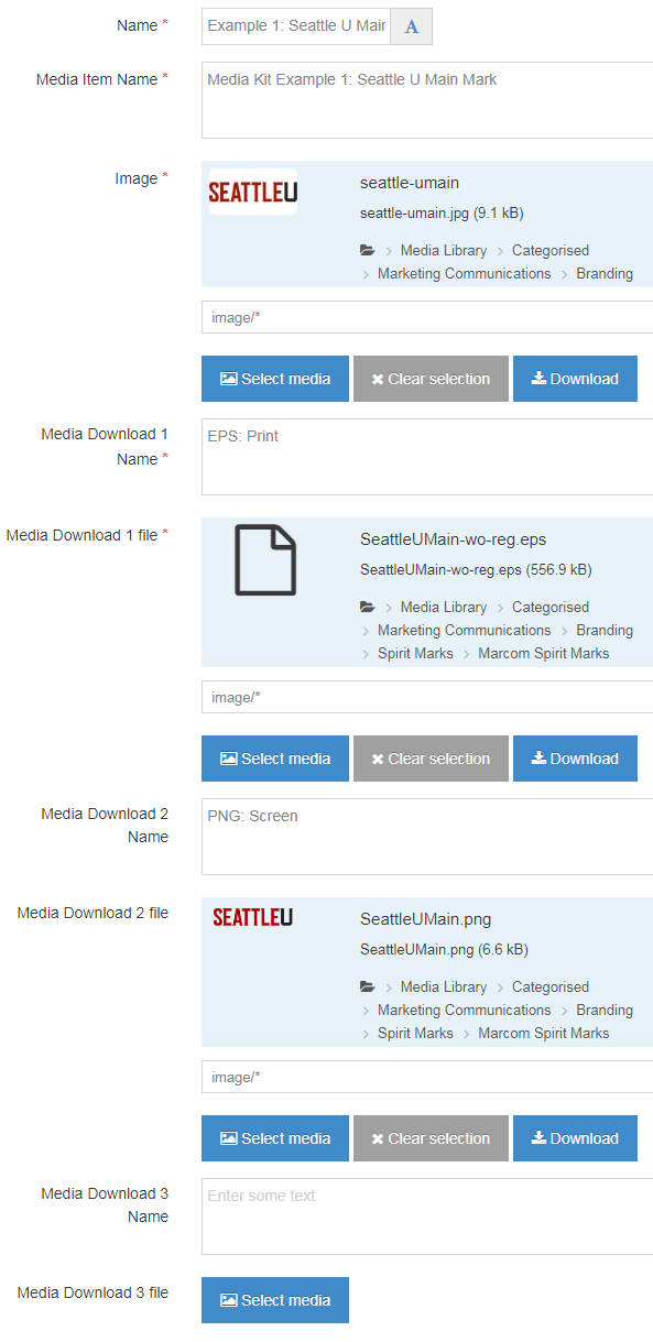
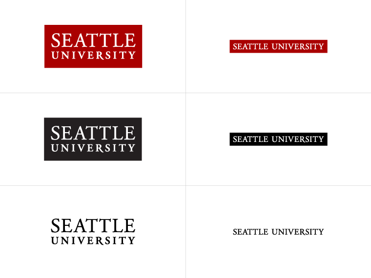
For each image, you can include up to three different variations, different file types or versions. In the examples below, each logo image has an EPS version (which is good for using in files for print) and a PNG version (which is good for displaying on screen). 

So if you want to provide additional variations you can use the optional fields:

  • Media Download 2 Name
  • Media Download 2 File
  • Media Download 3 Name
  • Media Download 3 File

Additional things to consider

Responsive layout

The Media Kit template is built so that three different equal-sized Media Kit content types can fit in one row, as shown on this page, though you do not have to have three Media Kit Content Items, you can only use one or two in a row instead. Then the widths of the Media Kit content items will change based on the width of the screen. If the screen or device is too narrow to display all three content types in one row, then the content items will stack horizontally rather than vertically.

Examples

  • Wellness and Health Promotion uses the Media Kit content type several times to share downloadable wallpapers for their Green Dot program:
    • Green Dot
  • Marketing and Communications uses the Media Kit content type repeatedly on many of their pages to showcase logos for university personnel to download and use in their own communication and marketing materials, for example:
Media Kit Example 1: Seattle U Main Mark

Media Kit Example 1: Seattle U Main Mark

Media Kit Example 2: Seattle U Black with Gray

Media Kit Example 2: Seattle U Black with Gray

Media Kit Example 3: Seattle U Reverse Logo

Media Kit Example 3: Seattle U Reverse Logo