Description
The Masonry Grid content type displays content items from a subsection into a full-width masonry grid.
A masonry grid layout is based upon a small number of columns (which you can specify) where the rows do not have a fixed height, so that the content blocks can be placed on the page based on available vertical space, sort of like a mason fitting stones into a wall.
Additionally, you can set the content blocks to span multiple columns within the masonry grid.
While several different content types work well in the masonry grid, it was designed to mainly feature masonry image tiles: a large image, which, when a user hovers over the image (or taps on the image, on a mobile device) a color overlay and colorful border will appear along with optional headline, text and link so that you can provide some additional information or context about the image.
Page layout:
Available in zones:
Permissions:
- Users must be added to the "Graphic Designers" permissions group in order to use this content type.
- We restrict access to this content type because it is a difficult content type to design and configure correctly.
- Request permission by submitting a request form.
When to use it
Use these content types when you have a lot of visual content to display, including a lot of images (but can also include video, infographics, etc.) and want to display them in an interesting masonry grid layout.
How to use it
Navigate to the section where you wish to add a masonry grid then click over to the "content" tab. Click "Create content" then select the "Masonry grid" content type.
Note: If "masonry grid" does not appear in your list of content, you may not be part of the "Graphic Designers" permissions group. Request permission by submitting a request form.
Configure the Masonry Grid Content Item
Required fields
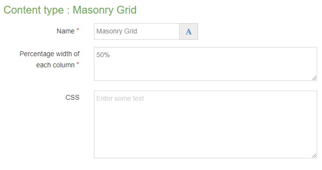
- Name
- The text in this field is for internal, informational purposes only, and appears in the list of 'content in this section.'
- Percentage width of each column
- In this field, type in what percentage of the width you would like each column to have, i.e. 25% (four column width), 33% (three column width), 50% (2 column width).
- Be sure to include the percent sign (%).
Optional fields
- CSS
- Field for custom CSS code
Create "Masonry" subsection
In the section where you have added the Masonry Grid content type, create a subsection named Masonry. (Please note: the subsection name must be exact in order for it to work.) You will want to uncheck the show in navigation option, as this section is just a container for the masonry content items, not an actual page.
Add content items to subsection
In the Masonry subsection, click 'create content' and add the content items that you wish to be displayed within the Masonry Grid.
Content types which can be added to the Masonry Subsection
Not all content types can be used in a Masonry layout. The below content types can be added to your Masonry subsection:
Is there another content type that you wish to use in the masonry layout? Send your request to the Web Team.
Masonry Image Tile
In the Masonry subsection, click "Create content" and select the "Masonry Image Tile" content type.
Note: If "masonry image tile" does not appear in your list of content, you may not be part of the "Graphic Designers" permissions group. Request permission by contacting the Web Team.
Required Fields
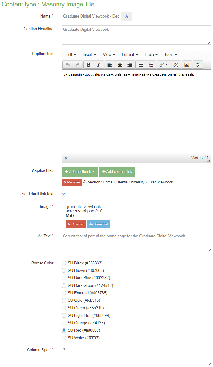
- Name
- The text in this field is for internal, informational purposes only, and appears in the list of 'content in this section.'
- Image
- In this field, you will select an image from your computer to add directly to this content type. This image field is a "direct add" rather than a "media library" image field.
- Make sure that your image has been cropped, resized and optimized for the web so that it is less than 1MB in size before adding it to this content type.
- Alt Text
- In this field, write a short, concise description (less than 125 characters) of the image that will convey the meaning of the image to users who cannot see or see well and are using a screen reader to navigate your website. You should include any text that appears on the image in the description.
Alt text is one of the crucially important elements of website accessibility, which is a legal requirement for the Seattle U website.
- Column Span
- In this field, you can specify a number (e.g. 1, 2, 3, or 4) to indicate how many columns wide you would like this image tile to have within your masonry grid.
Optional Fields
- Caption Headline
- The text in this field becomes an H3 heading that appears centered over the top of the image when the user hovers over the image (or taps on the image on a mobile device).
- Please make your headline short and concise, and be sure to test on preview to ensure that the headline doesn't spill off the side of the image tile especially if the image tile is a small one, or especially on mobile.
- Caption Text
- The text in this field becomes paragraph text that appears centered below the headline over the top of the image when the user hovers over the image (or taps on the image on a mobile device).
- Please make your text short and concise, and be sure to test on preview to ensure that the text doesn't spill off the side of the image tile especially if the image tile is a small one, or especially on mobile.
- Caption Link
- This link must be a section or content link, and it appears centered below the headline and text over the top of the image when the user hovers over the image (or taps the image on a mobile device).
- The link text defaults to showing the name of the section or content item you are linking to.
- If you wish to override this default, uncheck the box that says "use default link text" and a field labeled "Enter custom link text" will appear and you can add your custom link text, such as "Learn more" or "Apply now."
- Border Color
- This field is a radio button which allows you to select one of 11 SU brand colors, which appears as a border color around and over the top of the image when the user hovers over the image (or taps on the image on a mobile device):
- SU Black (#333333)
- SU Brown (#807060)
- SU Dark Blue (#003282)
- SU Dark Green (#124a12)
- SU Emerald (#008765)
- SU Gold (#fdb913)
- SU Green (#55b31b)
- SU Light Blue (#04a9c5)
- SU Orange (#ef4135)
- SU Red (#aa0000)
- SU White (#f7f7f7)
Additional things to consider
Selecting a Good Image
- Test your page in preview to make sure your masonry looks good at a variety of screen widths, including mobile sizes and desktop sizes. Of particular concern, please check to ensure that your headline and text do not spill off the side of the image tile on smaller screen sizes.
- Optimize your image for the web to increase load speed.
Accessibility
You need to be sure your content is as accessible to all users as possible.
You need to ensure that you include a description of the image in the alt text field that will convey the meaning of the image to users who cannot see or see well and are using a screen reader to navigate your website. You should include any text that appears on the image in the description. Make sure the description is short but conveys the meaning of the image.
Permission and Copyright law
Did you create these images? Are these images copyright protected? Do you have permission to use these images?
All web content must comply with the Seattle University Copyright Policy. Text, images and videos, and other media files, that do not meet these requirements must be deleted immediately.
In cases where copyrighted material is posted with the permission of the content owner, that permission must be attained in writing and be available for verification if needed.
Examples