![]()
Jaida Ho is based in Seattle, Washington. She likes to explore different mediums and styles, from fun, simple and colorful designs to those darker and fantastical. She enjoys creating vectors and illustrations to complement her work and incorporates these in most of her projects. In the future, Jaida hopes to enter the gaming industry and create characters and graphics there.
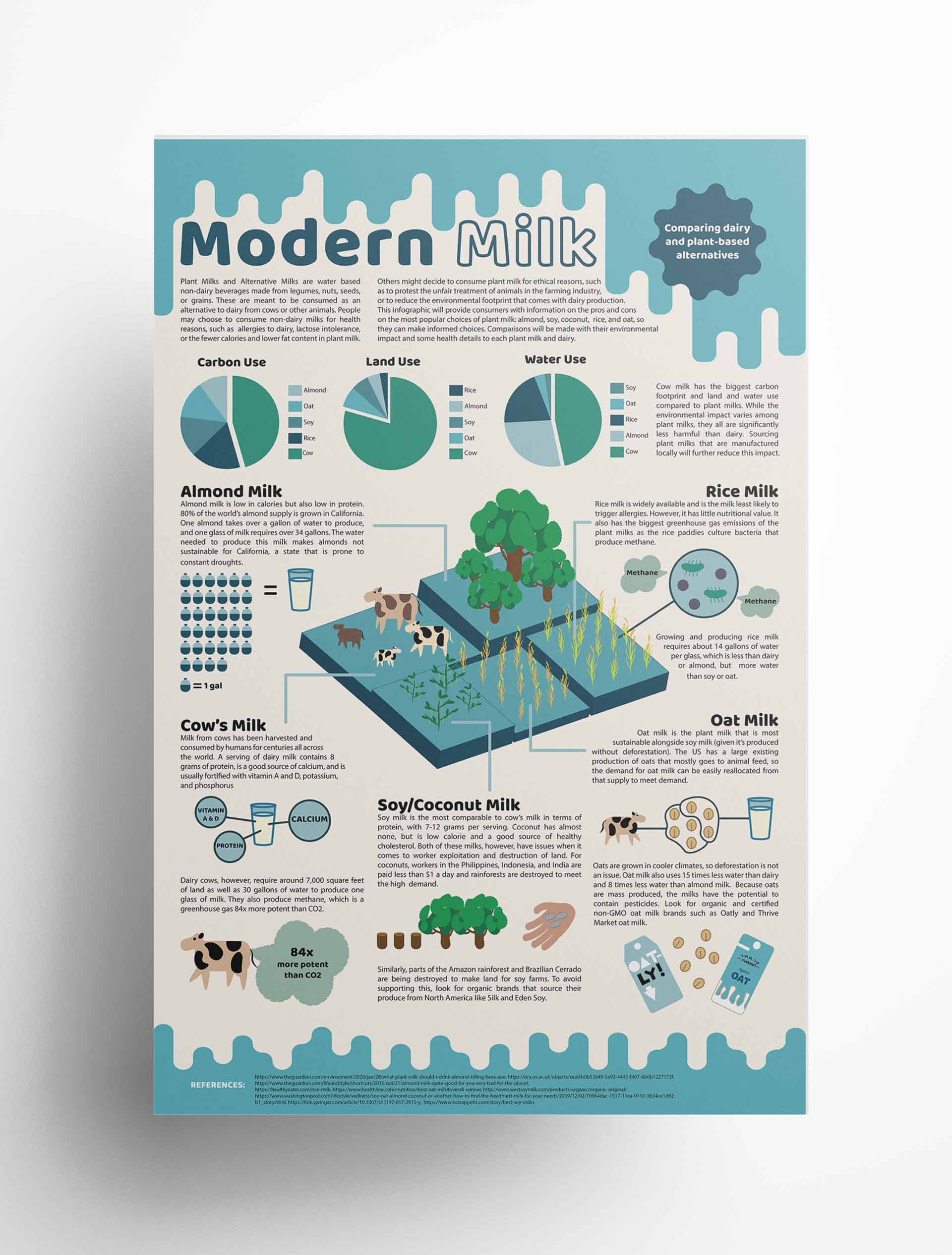
This infographic breaks down the environmental and ethical differences between dairy alternatives such as almond, rice, soy, and oat milk. It compares each milk's data to each other and cow's milk, as well as gives additional information on each alternative. This infographic is meant to give the consumer the tools needed to make informed decisions when buying dairy alternatives.
![]()
Hi! My name is Kailey and I'm a graphic designer based in Seattle. The intention of my work is to use design to it's full advantage, as I feel as if it provides the opportunity for change and meaningful interactions. My interested include bold and clean illustrative style, although I do enjoy other various mediums and forms of creative expression.
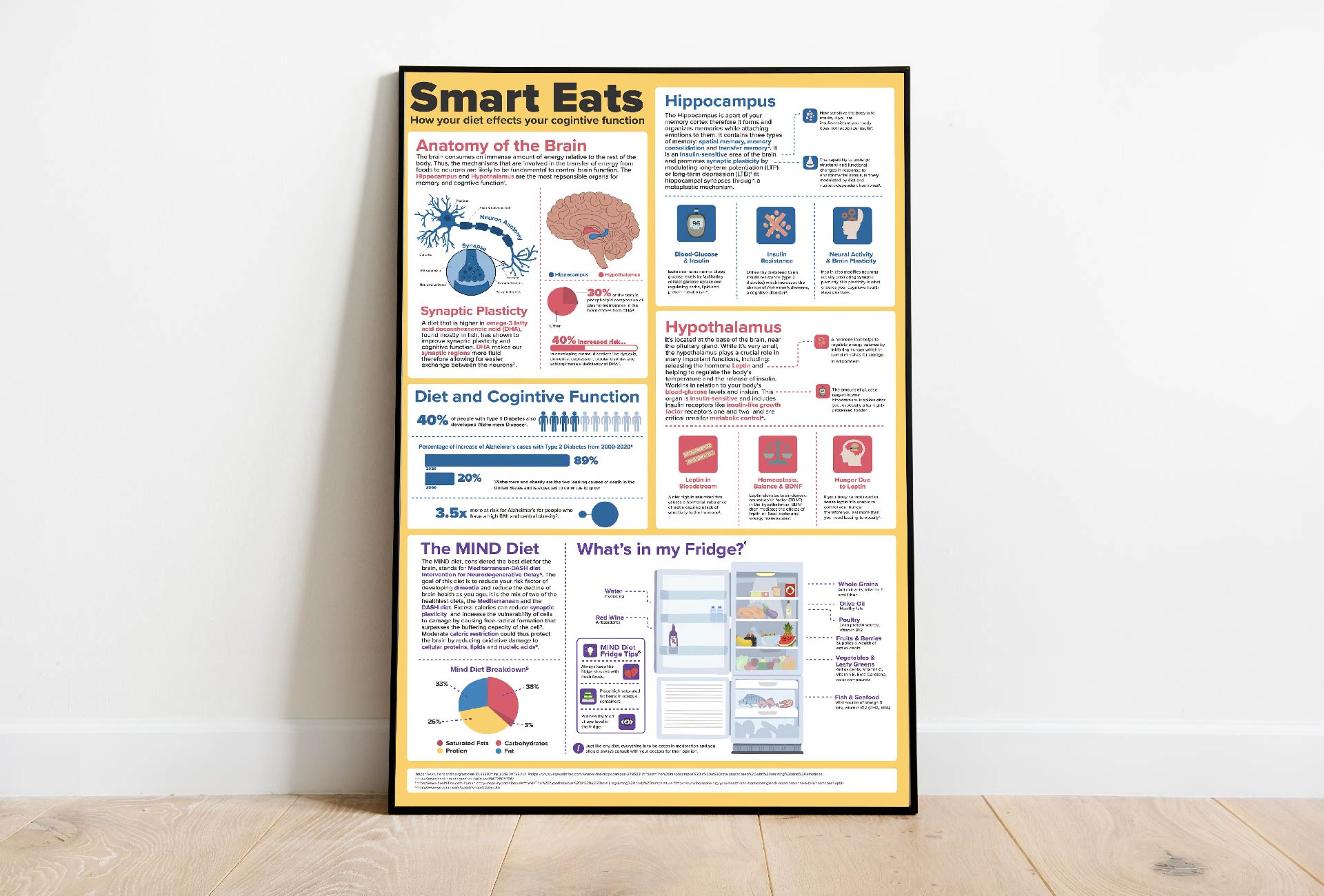
For this project, I took a complicated topic regarding the relationship between diet and brain health and transformed it into a visual story. It involved hours of researching, condensing information, and selecting what was most important. I choose to color coordinate different areas of the poster to allow for a more digestible experience. The illustrative elements are also there to make this fun and more exciting. My end goal was to teach people about the benefits of a healthy diet in terms of brain health.
![]()
Design is everywhere we look, communicating to us in both direct and indirect ways. It has the power to solve complex problems, shape public opinion, and drive social movements. I have an immense passion for using design to bring about social justice as well as community and company growth. I am a deep thinker with a versatile style that can adapt to client's needs, and I work hard to produce creative and unique visual solutions. I enjoy hands-on projects and specialize in branding, illustration, and print materials.
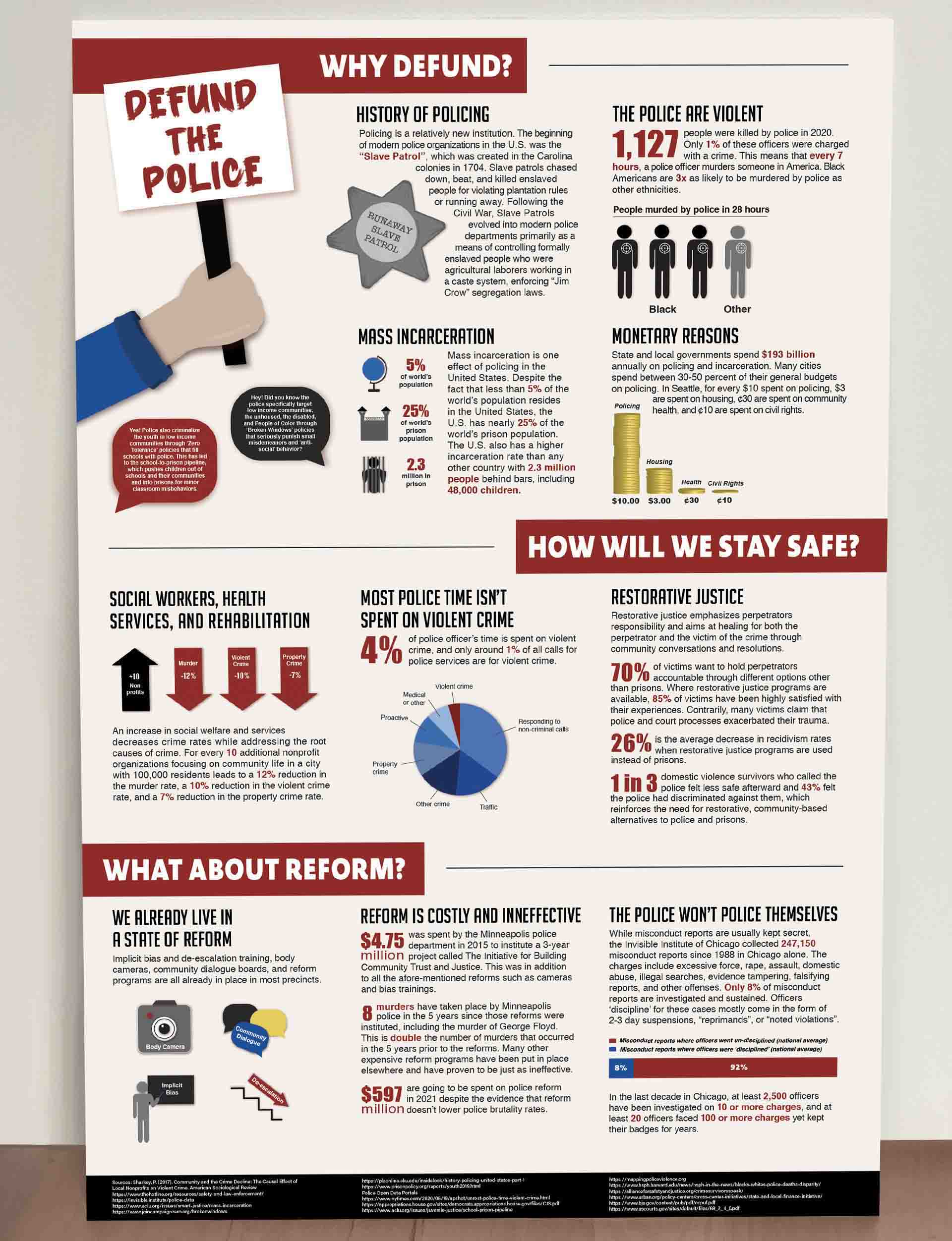
This information design addresses why the police need to be defunded. My target audience is people who may feel skeptical about defunding, so I included common questions like “why should we defund”, “how will we stay safe”, and "what about reform". I want my audience to leave thinking that defunding is not only a good idea, but an urgent necessity to living in a more just and humane world. My layout is supporting my content by having 3 clear separated layers that pose the 3 common questions mentioned above. I did not include any images, as images of police brutality can be triggering. My graphics are simple yet informative and help the text-heavy content to be quickly understood. My process involved over 30 hours of research, as I wanted to ensure that all of my facts were from reputable sources such as government websites, public data portals, and peer-reviewed journals.
![]()
My name is Faith Camara and I am a graphic designer with a passion for branding and marketing. Growing up on the coast of California has given me a deep appreciation for nature and has greatly influenced my design aesthetic. My work often incorporates the organic forms and colors that I see around me on a daily basis in order to create beautiful and functional designs for the everyday user. I enjoy working both collaboratively as part of a design team as well as individually to help companies, big and small, meet their branding and marketing goals.
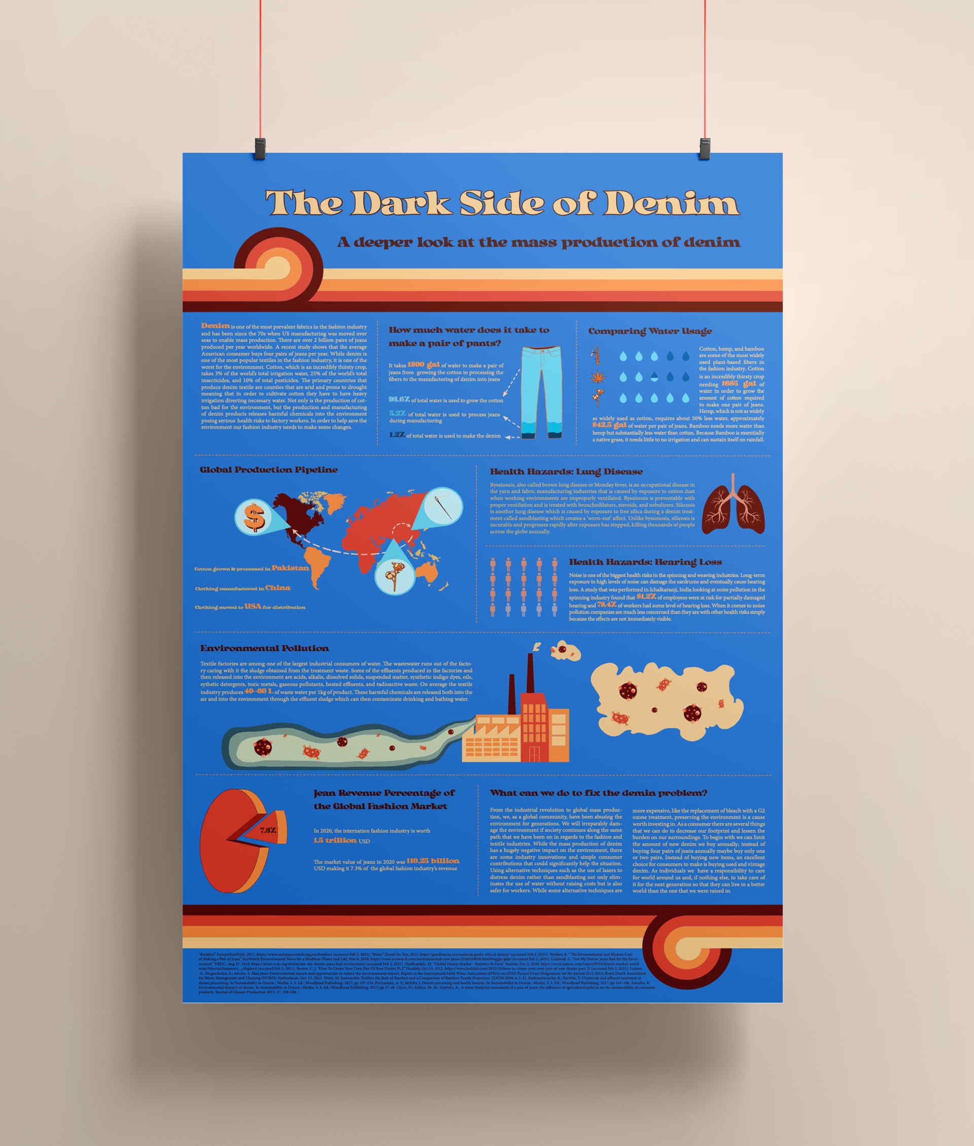
From the industrial revolution to global mass production, we, as a global community, have been abusing the environment for generations. The intention of this information design is to inform the general public about the harmful nature of the fashion and textile industry and more specifically denim production. While the mass production of denim has a hugely negative impact on the environment, there are some industry innovations and simple consumer contributions that could significantly help the situation. My hope is that after having looked at and read through this design, the viewer will be able to make a more educated and thoughtful decision when it comes to their denim consumption.
![]()
Hi there, my name is Soleil! A lot of my artistic expression is amplified through graphic and digital design, digital collage, and filmmaking. I often find that inspiration comes at the randomest moments, and I don't hesitate to strike while the iron is hot! When I am not creating commissions for different clubs around campus or shooting my latest short film I am baking, watching Terrace House, and getting lost in terraforming my island in Animal Crossing.
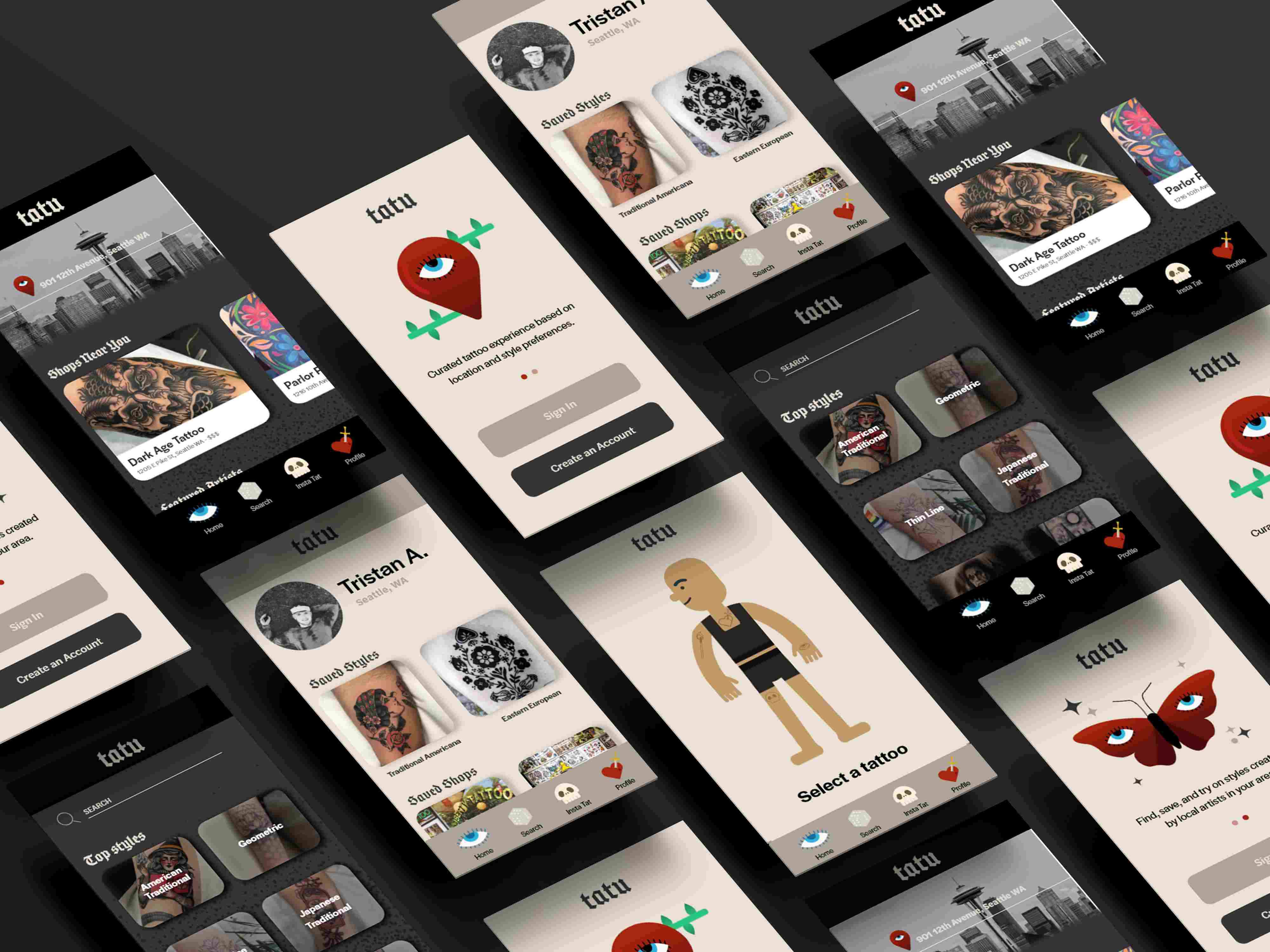
TATU is a crowd-sourcing application that enables users to find tattoo artists and styles in their area. With the styles of tattoos ever-expanding and evolving, the need to actively research artists and shops that match your style is important in having the perfect experience. Utilizing Adobe XD, I wanted to create a curated space for users to not only easily navigate artists and styles in their area, but to create their own curated experience. Users can explore and save shops and artists, research tattoo styles, and demo desired tattoos through in-app placement software. The result is a fun and streamlined way to expand your tattoo horizons!
![]()
Hi my name is Ashley Mufarreh. I believe great design has the power to evoke meaningful emotions and connections and I seek to create this experience in my work. I love to play with color and text to craft clear, innovative and fresh visual messages. I constantly challenge myself to get out of my comfort zone and explore new concepts, ideas and design mediums and thrive in the creative energy it generates.
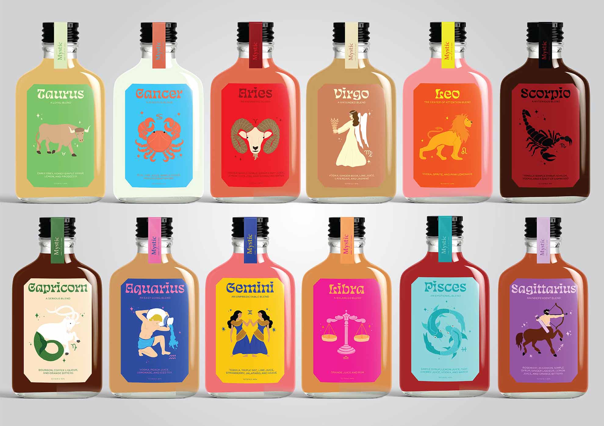
Mystic Spirits is an imaginary alcohol company I created that is unlike anything else on the market. The Zodiac Cocktail Collection is a selection of high-quality, handcrafted cocktails designed and made specifically for every sign of the zodiac. The drinks and labels are crafted based on market research data that I collected that reflects both the taste and color preferences of each sign. The original artwork I designed depicts the astrological symbol of each individual sign for easy recognition and creates a personal connection to the brand. Every bottle comes with four handmade, magnetic, reusable, celestial beverage markers and a collectible cocktail card. Mystic Spirits is a brand that values creativity, individuality, and quality.
![]()
Hi, I'm Sheena! My goal with design is to craft meaningful experiences that are user-driven from beginning to finish. I have always been interested in the journey of a user, from their choices to personas. I enjoy working with projects focusing on education, sustainability, food/water justice, and inclusion in design. My favorite part of being a designer is that you can never stop learning. Design has the power to tell stories, captivate an audience, and help solve problems. There is always room for growth and something new to learn.
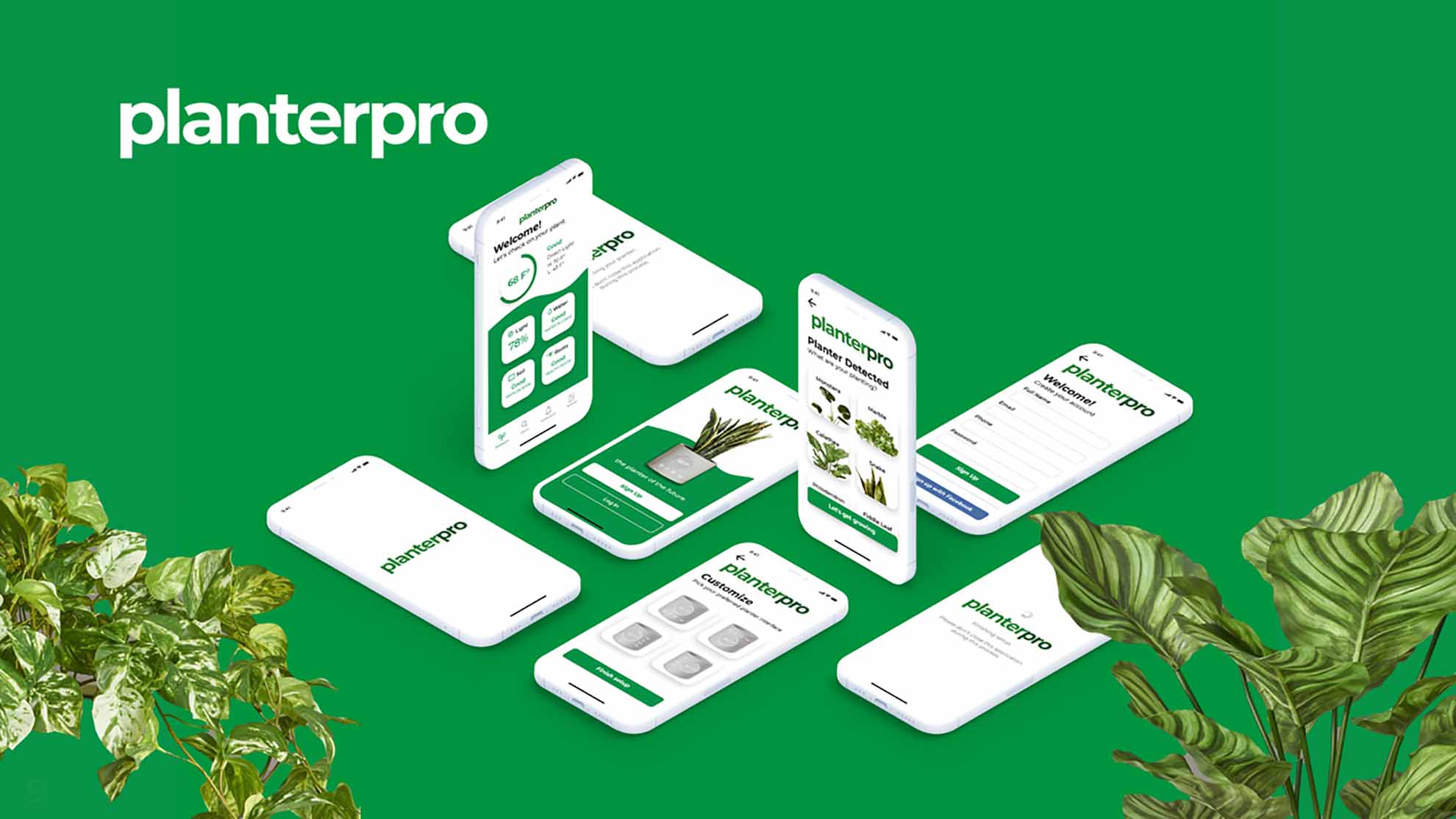
For our product design final, I created a conceptual high-tech solar-powered planter that can scan, detect, and inform the user through an app on soil/root health, light, and water levels of their plant.
![]()
Minh is a Vietnamese youth who is curious about the world and her potential of learning, understanding and interpreting it. She thinks the world that we're living in is a rich resource for art and art in reverse is a means to enrich the world with colors, shapes and voices. Through graphic design, Minh wants to help people deliver their voices to the world and communicate with it. Because voices need to be heard! That’s when her strengths come in handy including creative problem solving, typography, branding and print design.
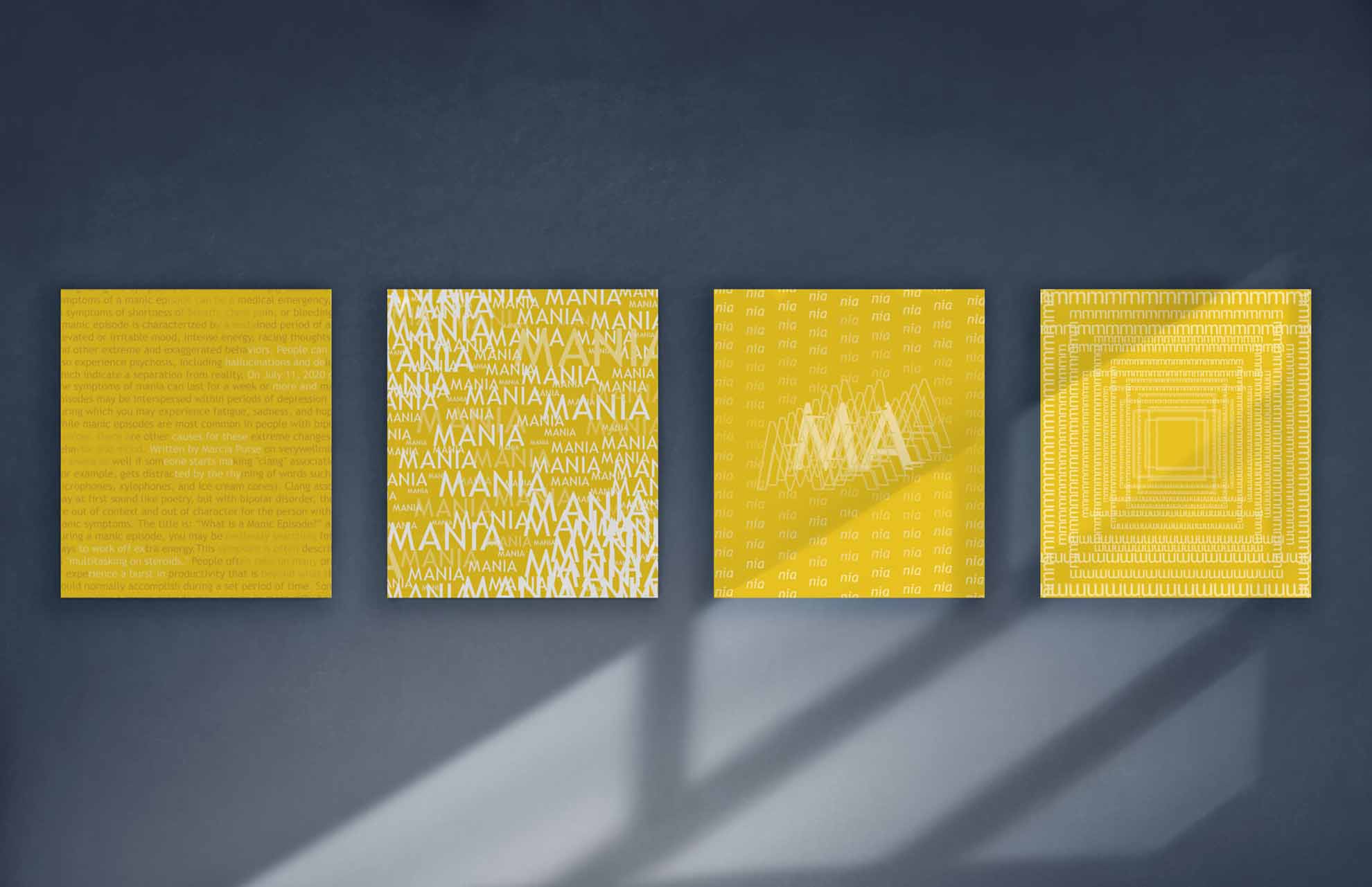
“Manic Outbreak” is a typographic piece that reflects the experience and symptoms of a manic episode. Within this period, a person suffering from mania is usually excessively excited, easily distracted, overreact or even delusional. The most visible symptom is the appearance of a huge flow of energy. On one hand, manic episode is associated with “positive” experiences as being highly energetic and optimistic. On the other, it’s in fact still dangerous with the potential of causing the lack of concentration, hallucination and self-destruction. Through this project, I want to raise the awareness about the fact that there are often two sides to a matter. People usually get tricked by the “positive/optimistic” appearance of a person/matter that they would miss or even ignore the problems behind. The neglection in such situation could later cause serious consequences.
![]()
“It’s impossible to completely understand others, but that doesn’t mean it’s pointless to try.”
Leon is a graphic designer who aims to understand emotions. His inspirations derive from the futuristic, digital, and fantasy genres. He uses design as a way to communicate complex and subtle emotions by telling a story. This is brought forth by his desire to understand people and be understood by others. By always being challenged to understand others, he continues to learn new methods of communication through the practice of design.
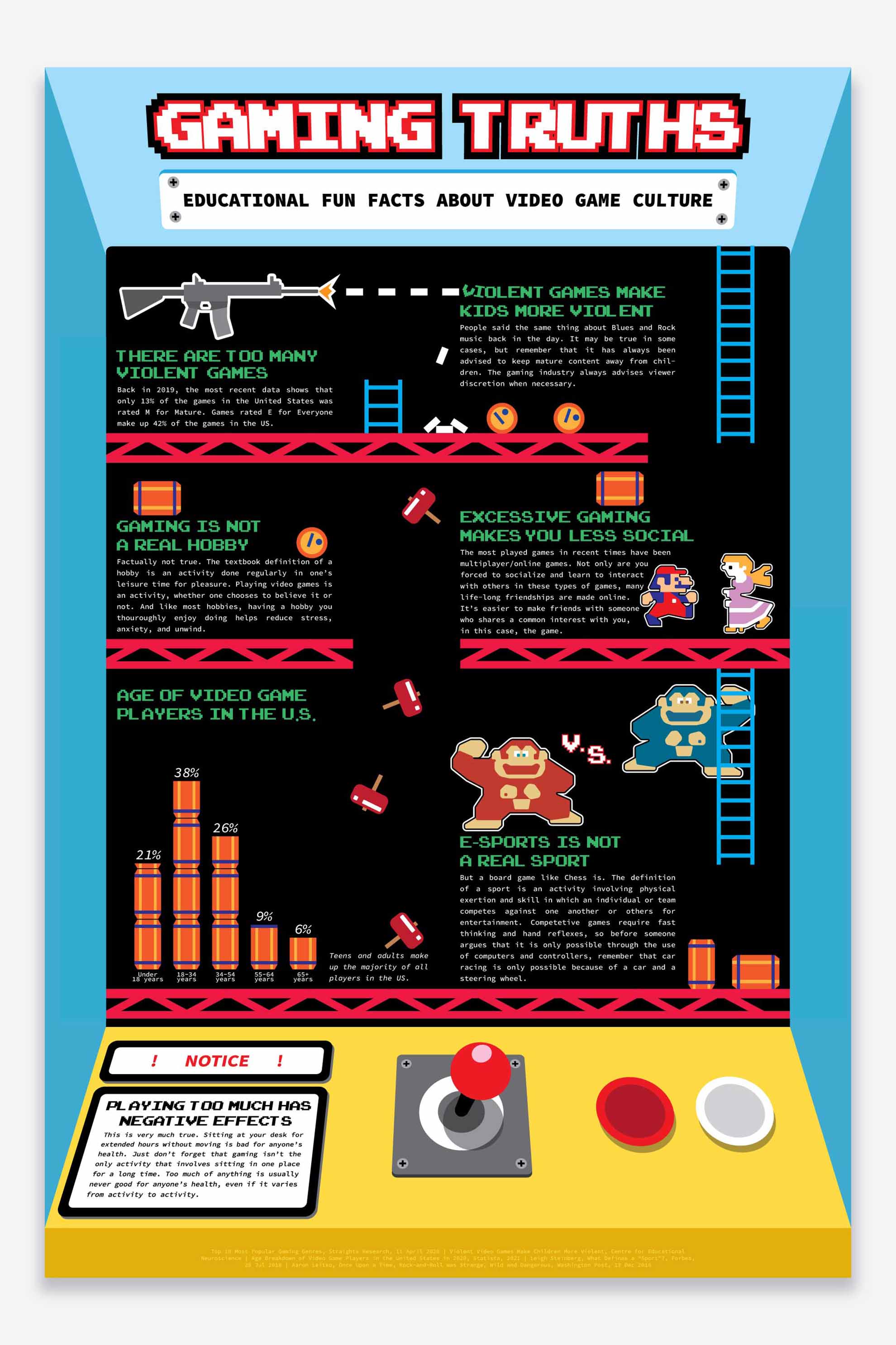
This infographic aims to present counterarguments to claims or myths about gaming culture. The inspiration for this came from the many degrading comments teachers, mentors, and media would often say about people who played video games.
It hurts to not be understood, but it’s more frustrating when people don’t bother trying to understand. Since my aim was to clear up these misunderstandings of gamers, I made the layout an arcade box with perspective to visually draw people into the poster. Titling it ‘Gaming Truths’ is intended to foster curiosity in the viewer, with bolded headers stating a myth as truth to trick those with negative preconceptions on gaming that I agree with them. By reading further you will find that I’m actually subverting the previous statement, and instead hopefully giving viewers enough information to question negative notions on gaming.
![]()
Hi! I’m Julie Lee, a graphic designer, creating unique value through illustrations and graphic design focused on human-centered designs and technological strengths. I love what I do, and I want to create designs focused on creative approaches to humanizing the problems we need to solve.
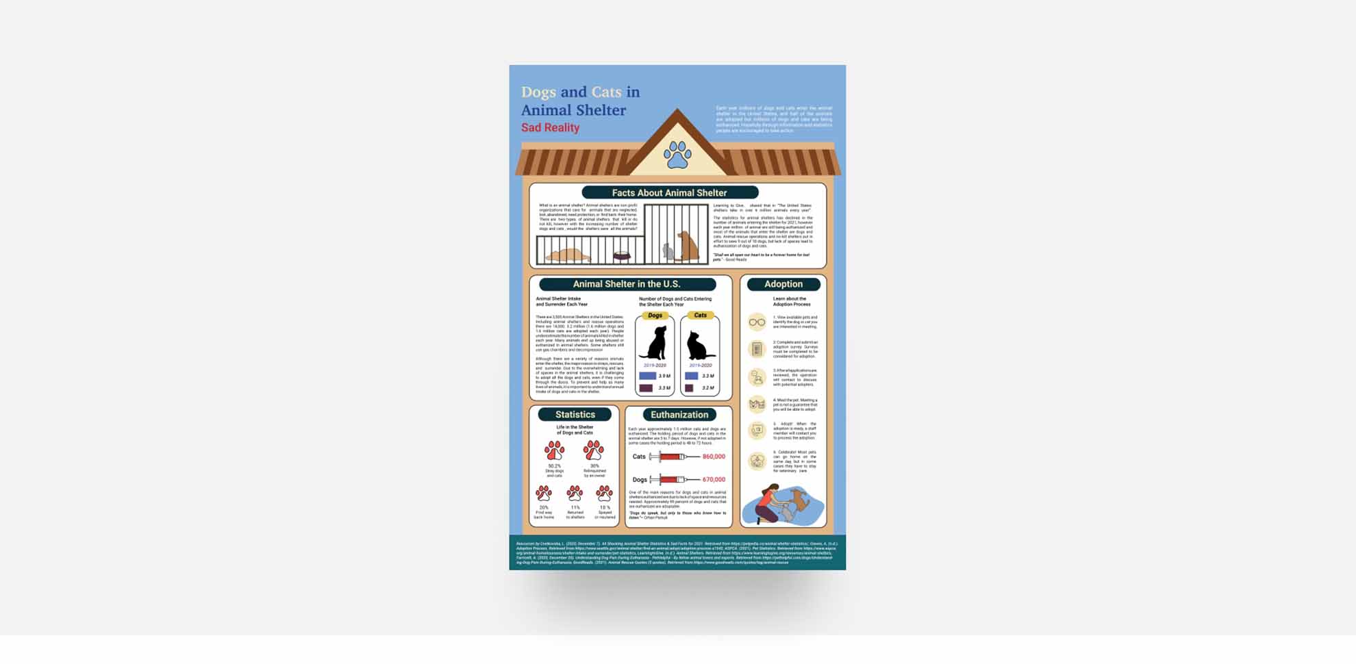
For my information design, I researched data and statistics of dogs and cats in the animal shelter. My goal is to encourage viewers to learn more about the facts and statistics of shelter dogs and cats, and to bring interest in learning about the adoption process from animal shelters. I created a shelter illustration that unites all the information and made graphics related to a paw print, dog, and cat illustration.
![]()
I am a digital designer and 3D modeler based in Seattle and have studied here for majority of my life. Having the access to a workshop of my own have greatly impacted my work for the past year for the better because I get to constantly experiment with what I can do with my designs. Problem solving as a designer has brought me great opportunities to explore the potential of my design as well as meeting some amazing people.
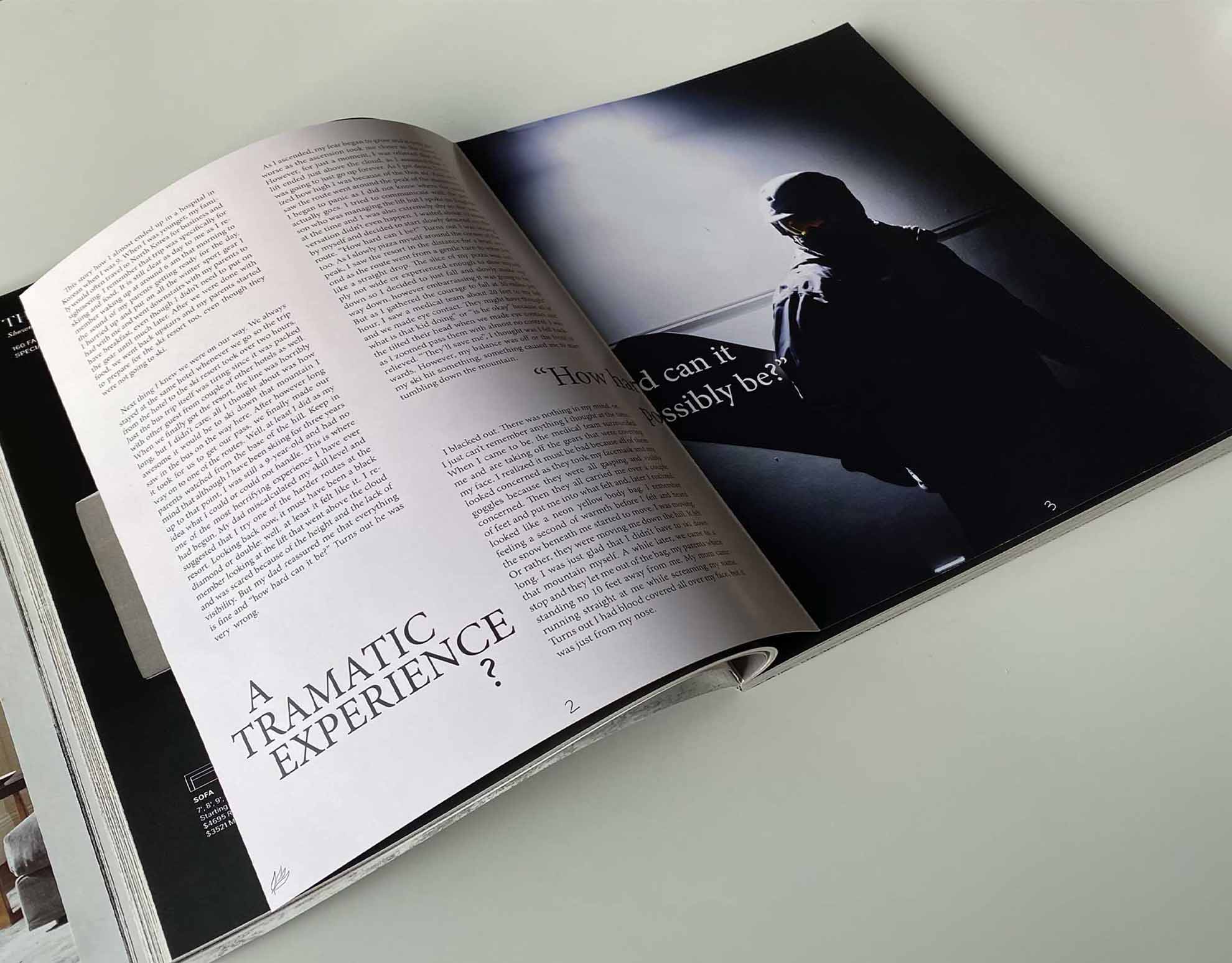
Aiming to recount for my traumatic experience of almost losing my life while skiing in Korea when I was little, the layout is monotoned comparing to the dark, underexposed photo which portraits the kind of memory this is.
![]()
Hi my name is Kathryn and I’m based in Seattle, Washington. Design is everywhere and I believe that good design is crucial to creating a better world. I especially like information design, brand identity and UX/UI. With UX/UI design, I love figuring out how to make the design more effective so that the message is clear and keeps the user engaged. I draw my inspiration from everywhere and love to switch up my style to see what I’m capable of doing. When I’m not designing, I like to cross stitch, embroidering, cooking and discover new random hobbies.
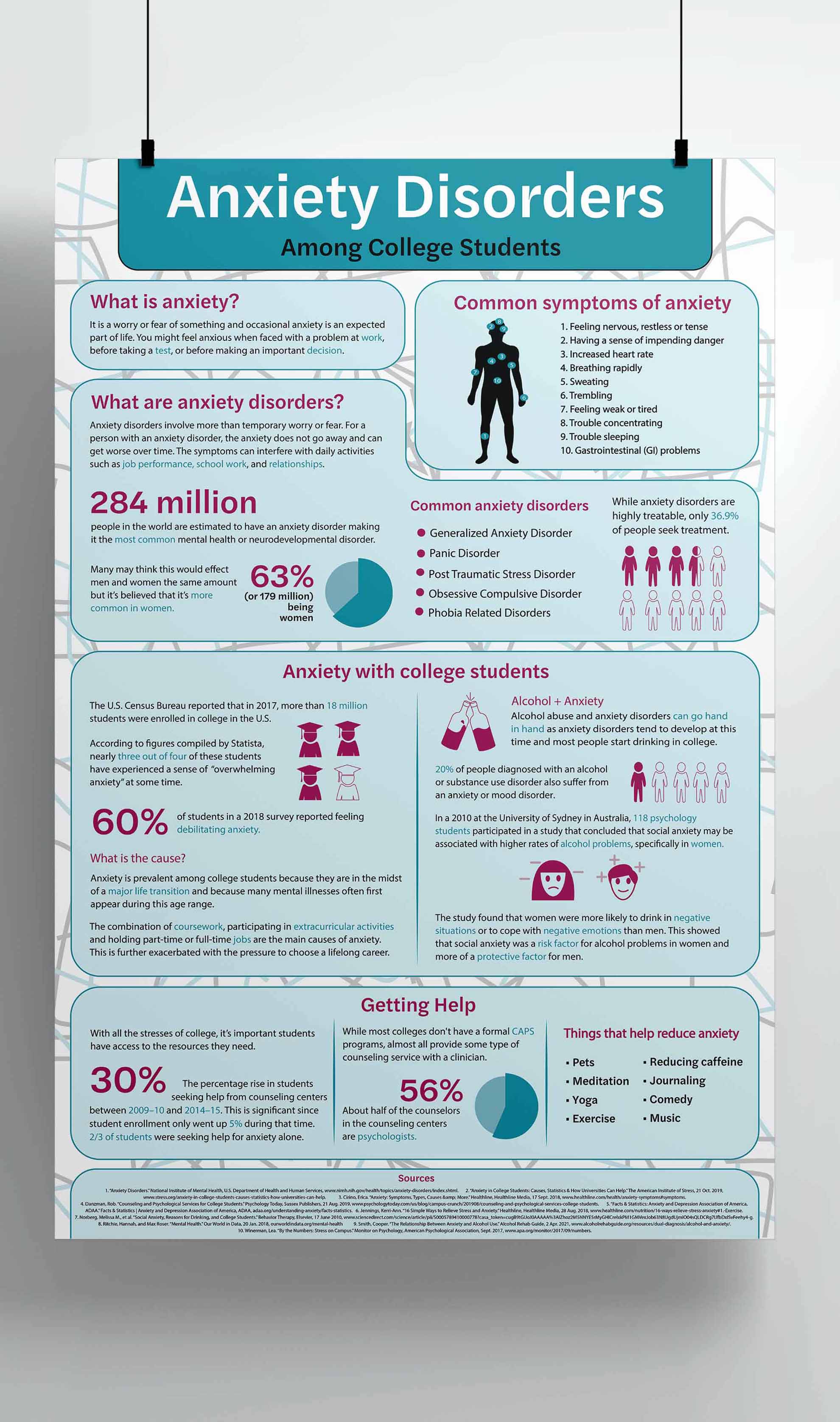
My infographic is about anxiety disorders with a focus on college students since that is typically the age group where these disorders develop. I also decided to focus on college students because during this time we are going through a big transition and so paying attention to our mental health is crucial. I wanted my audience to become more knowledgeable about the impact of anxiety disorders since it is the most common mental health disorder in the world. I included statistics, pie charts and illustrations in order to help aid the information and help keep the reader engaged throughout the poster.
![]()
Hi, I’m Marina Morales. Graphic design is my passion <3
Digital illustrations are my forte and I rely heavily on them in my designs. Incorporating them allows me to create dynamic and versatile pieces. My other interests in art include acrylic painting, charcoal drawings, and traditional pen and ink drawings. Most of my art centers around drawing dragons and other fantastical creatures so I tend to include that motif in my design projects as well since it reflects what inspires me. My geckos deserve a shoutout for truly inspiring me. They’re my muses.
![]()
This magazine layout was created as a project for my Graphic Design 2 class. It was made more as a passion project for me as it focused on my two crested geckos. I captured their mischievousness through the vibrant illustrations I did of them. In my first spread, it’s meant to appear as if my gecko is sticking to the front of the page. I also added some gecko footprints to make it seem like she has been walking on that half of the page. I chose pastel colors since the palette is meant to go with the lighthearted and silly tone of the story. I also wanted to pick a color palette that made the illustrations of my geckos stand out.
![]()
I've always considered myself an Illustrator before a Designer, but the reality is that I'm both. I'm inspired by comic books and cartoons, and I try to implement these influential mediums in all my work. I'm usually listening to music while I'm designing, and more often when I'm not.
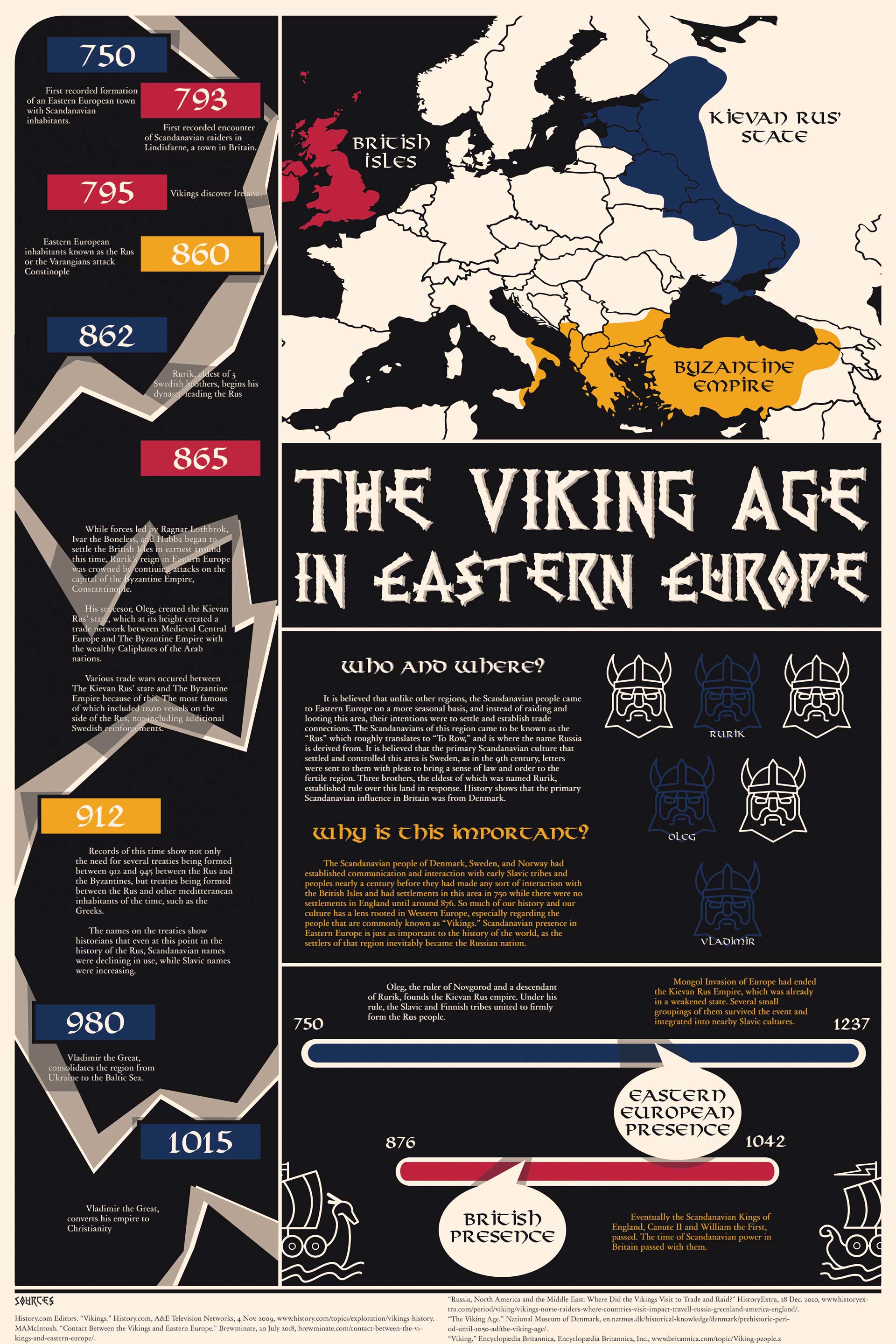
A historical and anthropological study into the spread of the Scandinavian peoples in Eastern Europe.
![]()
Russell Bauder is a graphic designer who has experience working with a multitude of different types of projects, including poster and flyer design, UX and UI design, as well as 2D animation. Graduating Seattle University in 2021, Russell looks forward to gaining additional experience in the graphic design industry. When not working on graphic design, Russell can be found outdoors in one of Seattle's many parks or indoors playing games with friends.
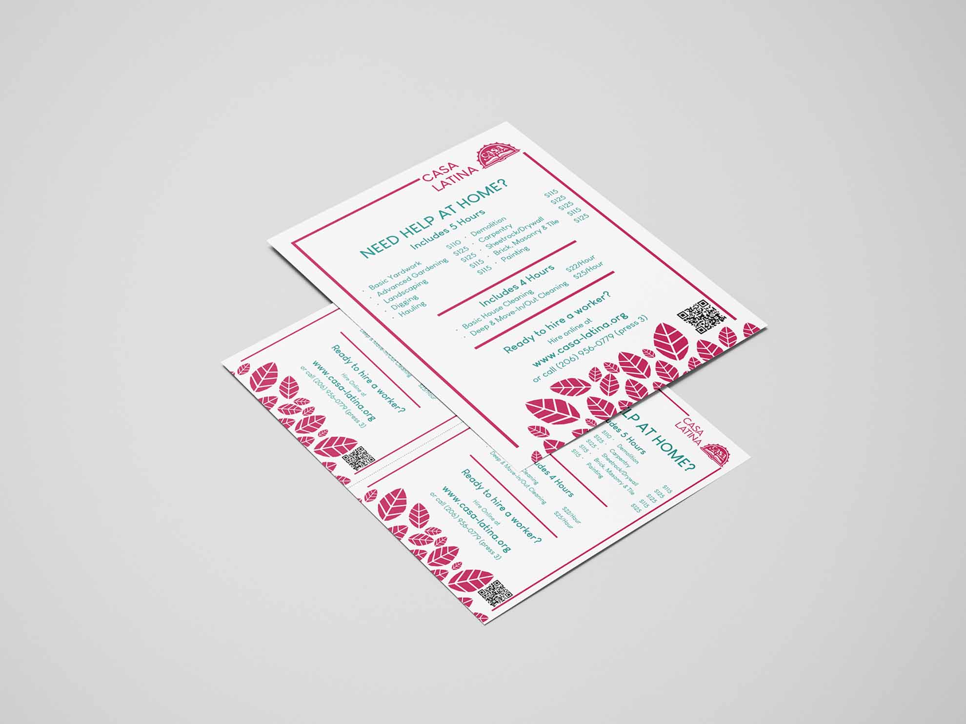
The Casa Latina Flyer was a project for a local non-profit to redesign the flyer they use to advertise services and rates for their home care service. The old flyer was in black and white and had many cartoons on it, and it was showing its age. The NPO wanted to have more color and fewer cartoons. As such, the redesigned flyer makes use of the organization's colors and eliminates any cartoons. Graphically speaking, the flyer uses leaves on the bottom of the flyer to emphasize their lawn care business. I created two versions of the flyer; a full-size flyer to hang up on bulletin boards, and a half-size flyer to hand out.
![]()
Design gives us the attention we need to express ourselves and be heard, and I’ve found a way to creatively communicate my thoughts and ideas through my creations. It’s a visual tool that’s thought-provoking; it competes for our attention in a way that leaves a lingering thought and the drive to take action. With a focus on branding, print, and UX design, I was able to develop a broad set of skills that enabled me to solve visual-communication problems with impact. My goal is to create designs that help people find their place in both the physical and digital worlds.
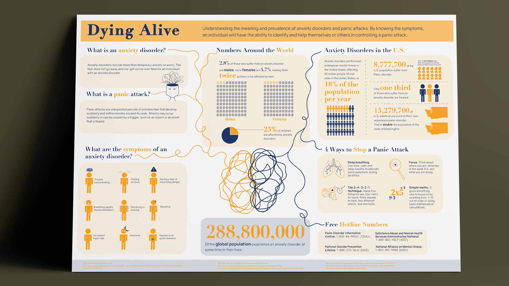
Dying Alive is an infographic is about controlling panic attacks. This includes the definition of an anxiety disorder, panic attacks, symptoms, ways to stop the panic attack, and hotlines available to help an individual in need. My main goal for this design is to inform and help those who are suffering from panic attacks and educate those who know little about it. By doing so, people can step up and help calm individuals experiencing panic attacks by applying the techniques I’ve included and recognizing the symptoms. I decided to add line art to the rigid graphics that I have to make it more intimate and personal. My goal was to create a comfortable space for the audience when viewing it.
![]()
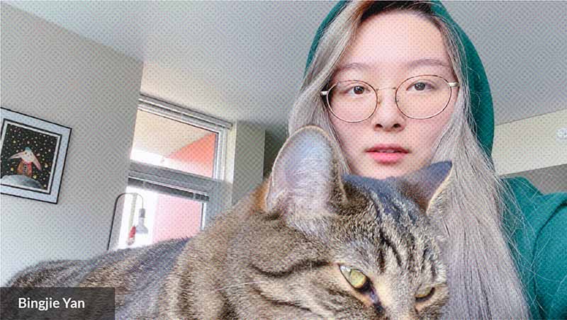
Hello! My name is Bingjie Yan, and I'm an international student from China. I spend eight years study abroad, and this will be my last quarter. I'm in design major, which graphic design is the most that I passionate about. I love to design artwork with creativity and passion. Especially, when I try to communicate with the audience, being able to deliver the message I want to convey with precision design is important. It is a great sense of achievement for me when my design is approved by the audience.
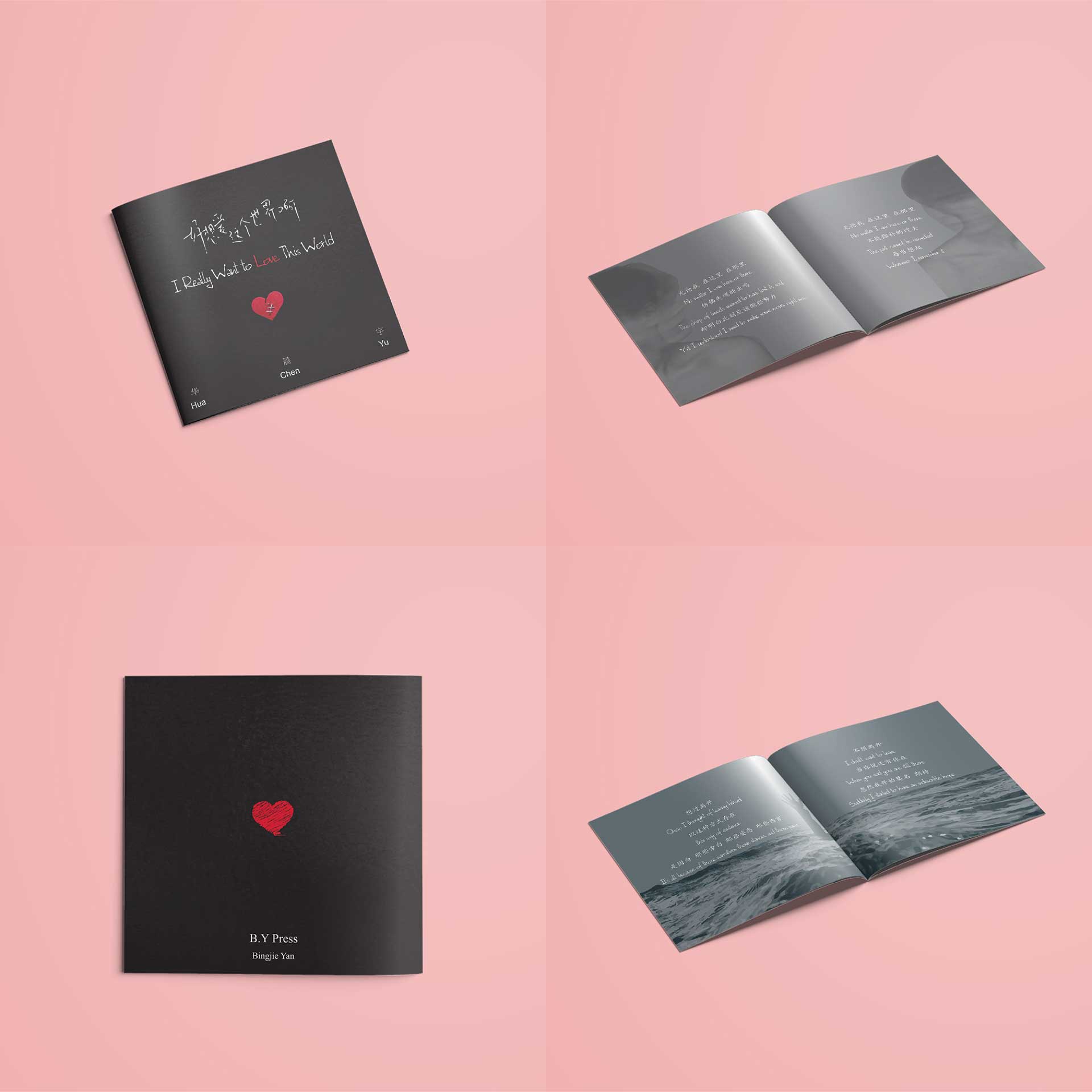
This song is from my favorite Chinese singer - Hua Chenyu. He wrote this song for people who suffer from depression. This song made me cry when the first time I listen to it because I had a bad mood that year. This song expressed my inner self and my heart, which is why I want to create an English lyrics album just for this song. I want more people to know the meaning behind it, and spread it to the people who need it.
![]()
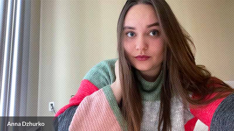
Hi everyone, my name is Anna and I am a senior at Seattle U studying Design. I love designing things and I love photography. I am very outgoing and friendly person, and people say I am very funny too. Got it from my dad, I guess :) I hope you enjoy my artworks!
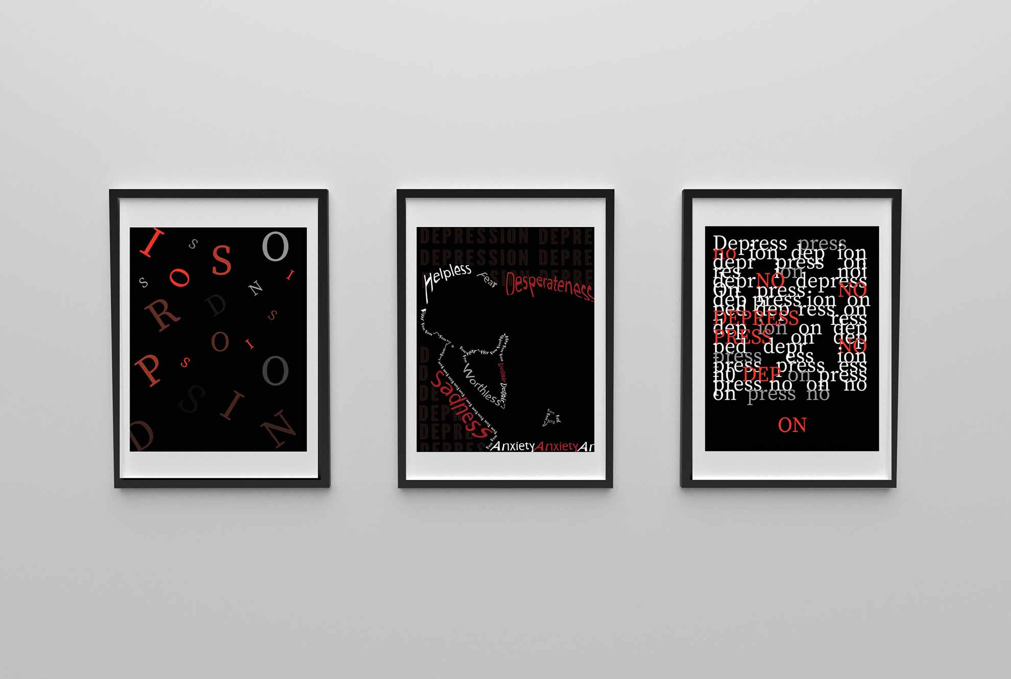
This is my favorite project that I had to do. I decided to choose the word "Depression" for this project. One of my friends had a serious depression in the past and he told me a lot about his feelings. He inspired me to show these feelings through art. The project consists in only typography and nothing else. The idea of a poster on the left was to show how inconsistent letters are; Some of them are faded and some of them are bright. I was trying to show how fast feelings change while being depressed. In the middle, you can see a man’s silhouette made by adjectives that people feel in this condition. On the right poster, I was trying to show the fight between internal and external world. People try to fight depression from inside but sometimes it is hard.
![]()
My creative work includes oil painting, embroidery, editorial photography, fashion, and graphic design. I derive much of my inspiration from looking at artists of decades past. Interior design and fashion are also major parts of my artistic inspiration and my self expression. Seeking beauty inside spaces, and pursuing imaginative apparel keeps me engaged with my creative side, helps to nurture my artistry, and allows me to continue evolving as a maker.
With my art and designs I aim to convey a feeling of happy harmony, and instill peace and balance in oneself. I want my viewers to leave their troubles and be taken into my art, to feel as though they are in a dream of some sort, and my art is their new reality. Through research, observation, communication, and collaboration I get to know my audience, their circumstances, and dreams for their future. After gaining a deep understanding of those whom I hope to reach, I use color, composition, typography, photography, and illustration to initiate a dialogue. Through design and aesthetics, we converse about lifestyle, culture, history, and beauty. In this vision of the future we meet, connect, and unite.
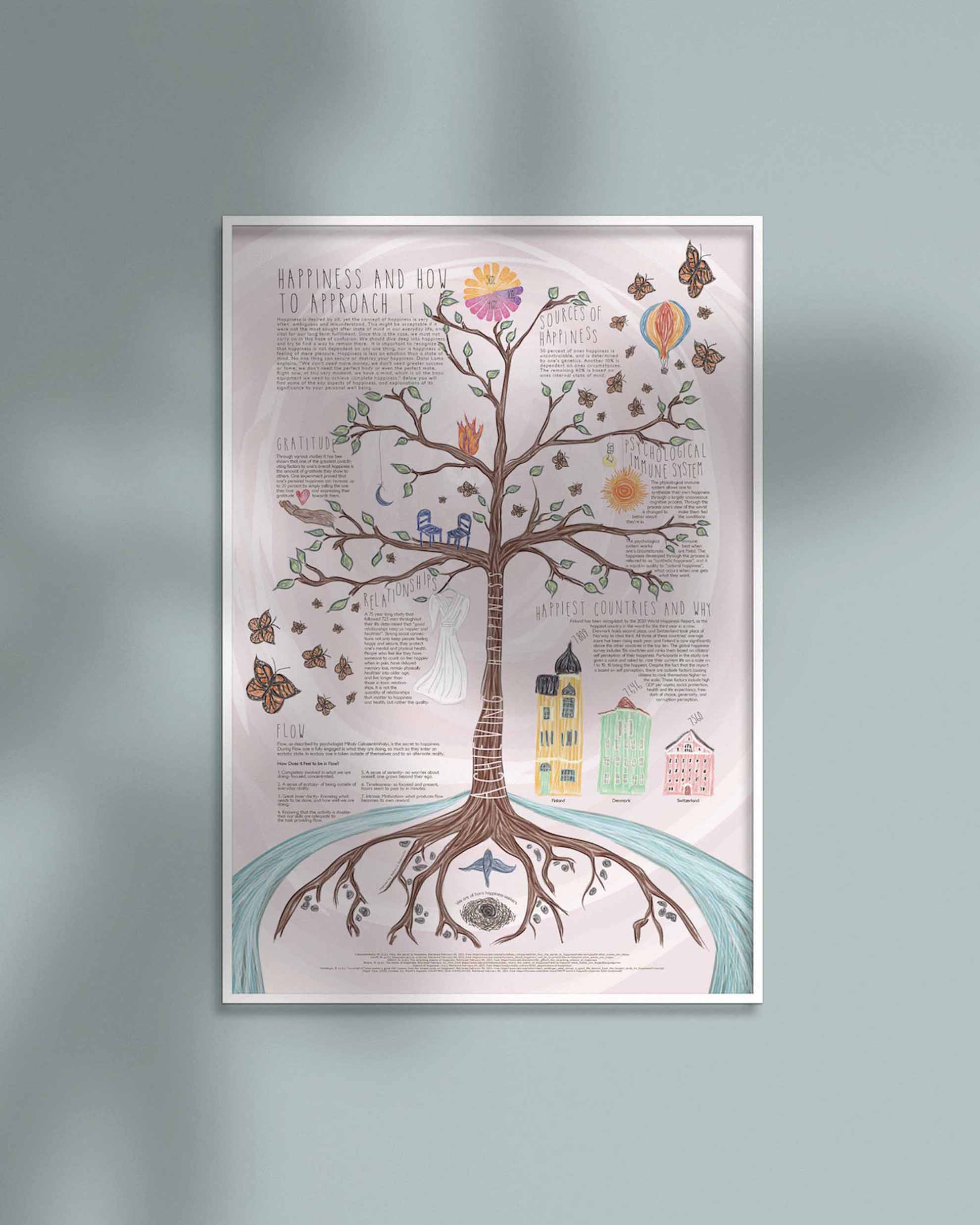
Achieving Happiness is the product of a month-long study of the elements of happiness, and the development of an infographic to communicate the research findings. With the goal of assisting people on their journey to fulfillment, I focused on breaking down false notions about happiness and teaching people the most fundamental lessons surrounding one's well-being. The great importance of this message necessitated an encouraging and welcoming design. Through the use of soft colors, an illustrative aesthetic, and an asymmetrically balanced design, I am able to guide my audience through these lessons with warmth and comfort.
![]()
Hey I’m Kim, I’m a Filipina graphic designer based in Seattle, WA. I love designing with a mix of pastels, gradients, and holographic foils to create visually stunning work. When I’m not sitting at the computer or yelling expletives at a printer, you can find me at a music festival, drinking boba, or playing with my dogs, Ginger and Bruno.
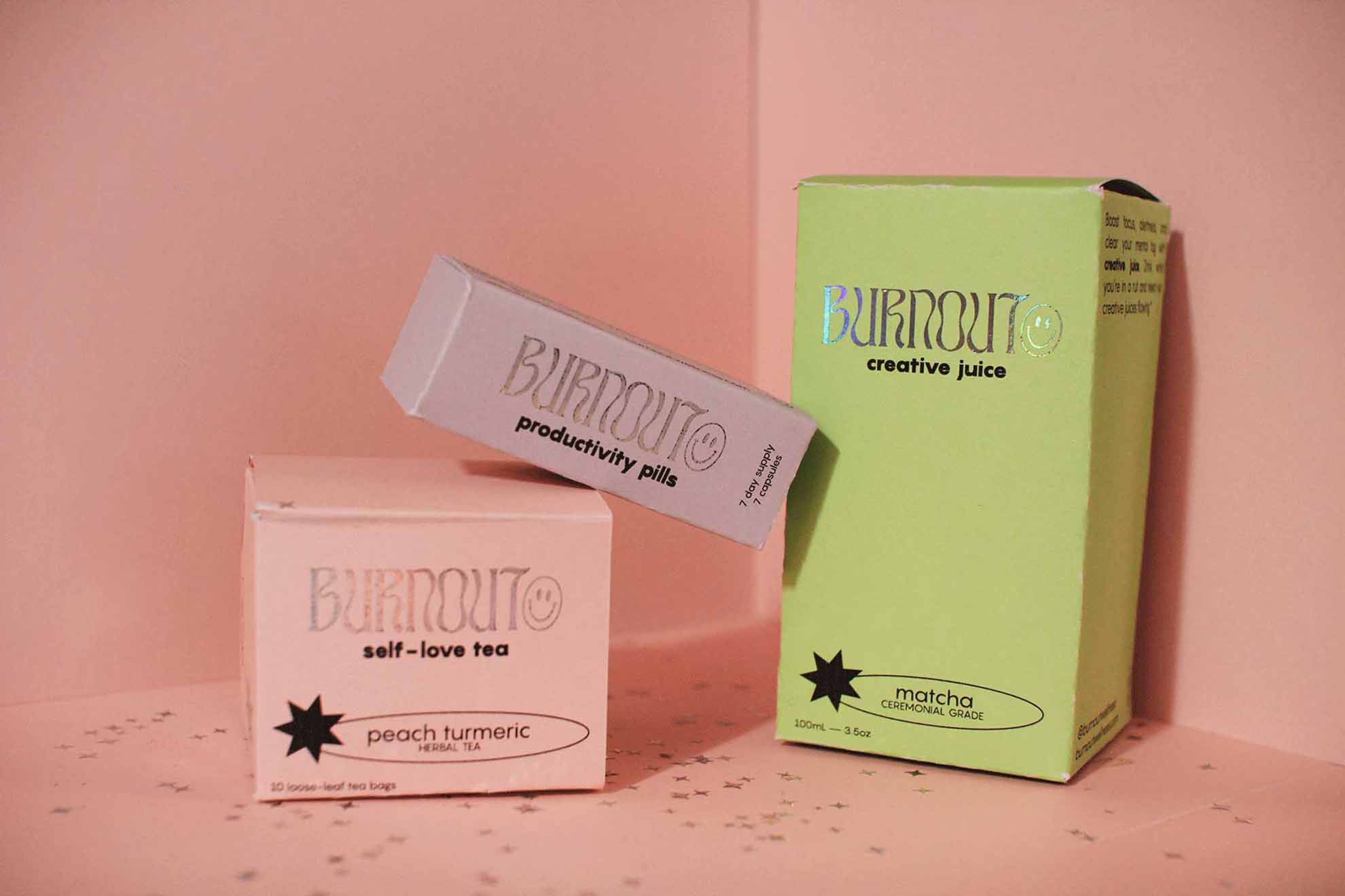
burnout is a futuristic health and wellness supplement line, made to kind of poke some humor towards the COVID-19 pandemic. The products line includes Creativity Juice, Self-Love Tea, and Productivity Pills. I was inspired to make these products because I’ve been focusing a lot on self-help and wellness being at home all the time and kind of wishing there was just one “get better” pill.
![]()
My name is Briana, and I am a senior student of design here at Seattle University. I believe that one of the most important aspects of design is communication with and connection to other people, and it is something that I like to keep in mind whenever I am creating something. I enjoy making things that I think will have an impact on others, and that I hope will show them a little about how I think and what I care about. I take a lot of inspiration from nature, storytelling, and color, and I try to incorporate those things into my work as much as possible.
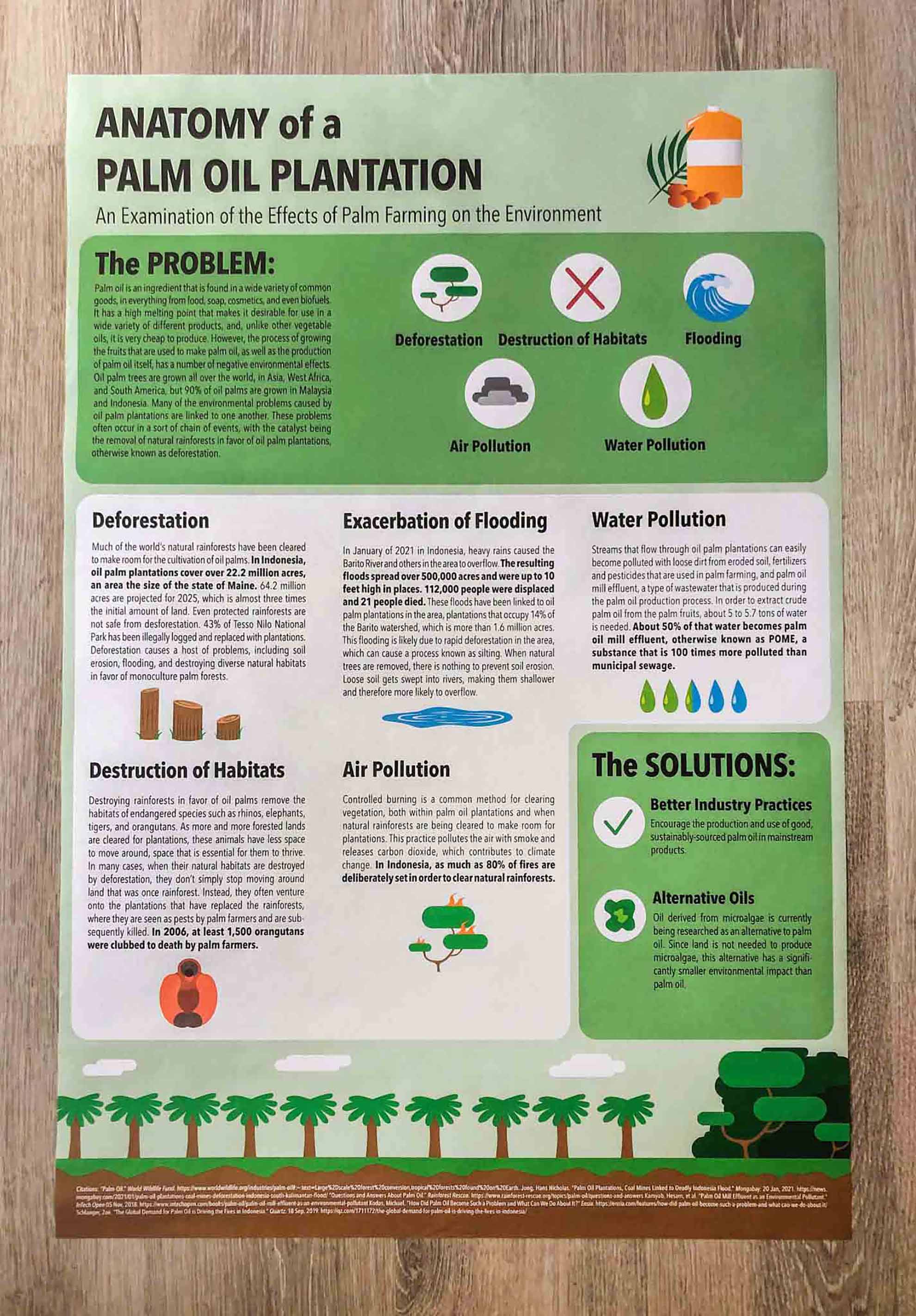
I have been interested in issues surrounding the global environment and climate change for a while, and I used that interest as the basis of this project. I chose the issue of palm oil plantations specifically because it is a problem that affects everyone to some degree, whether they are aware of it or not. The goal of the project was to spread awareness about the effects of the unsustainable practices of the palm oil industry.
![]()
Welcome to my artist page! If you like what you see here, feel free to go ahead and take a gander at my website too, what’s there to lose? I am from Portland, Oregon, but my design style has been greatly influenced by life in Seattle and time spent in Copenhagen, Denmark. Aside from a good typeface, I love stand-up paddle boarding, hiking, photography, and adding to my ever-growing collection of design books. Design is problem-solving, and I take pride in finding creative solutions to complex challenges.
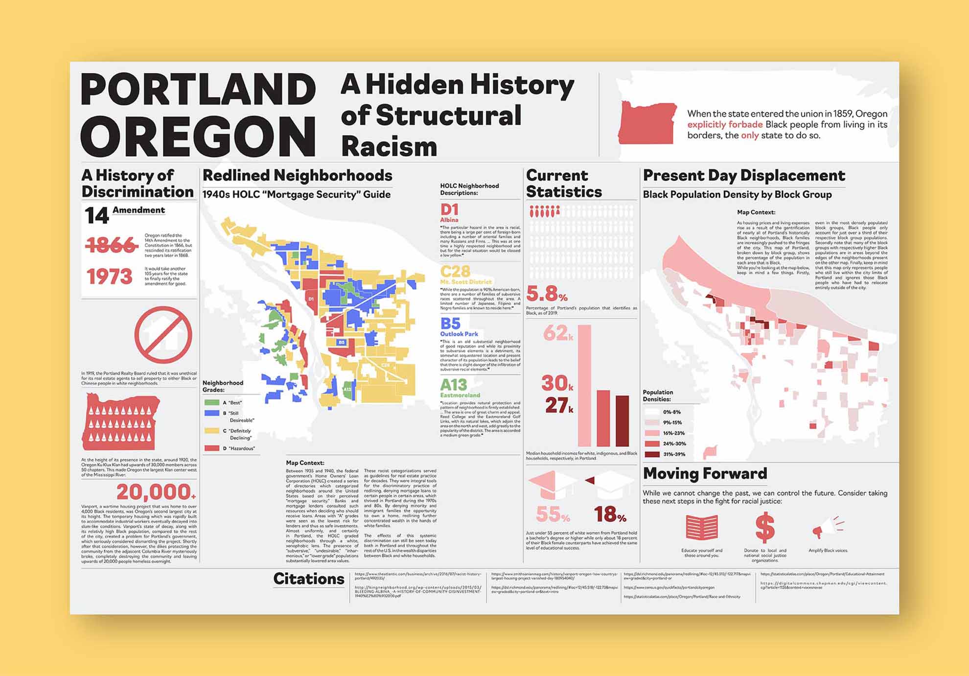
Portland bills itself as a progressive, accepting place for all, yet it is one of the least diverse large cities in the United States. Like many other privileged white people from the area, I was brought up with a sense of pride in the fact that my hometown was seemingly above the historical ills of racism when in fact, exactly the opposite was true. These issues are by no means limited to Portland, however, as BIPOC communities in this country face challenges in nearly every facet of life. As a society, it is always difficult to reconcile with our ugly past. So much so that it is most often simply ignored, but choosing ignorance only compounds the problem. I hope that viewers take time to reflect on this work and that such reflection motivates people to address the contemporary issues of racial discrimination that threaten our society.
![]()
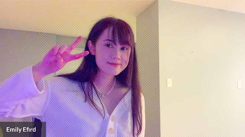
My name is Emily Efird and I am a junior design major from Seattle! When it comes to design, my main interests include illustration and packaging design. I consider myself to be a bit of a collector, and often find myself inspired by "cute" objects and little keepsakes. I aim to create works that engage the viewer in a way where they think "oh that's cute," and then want to actually keep the work I make.
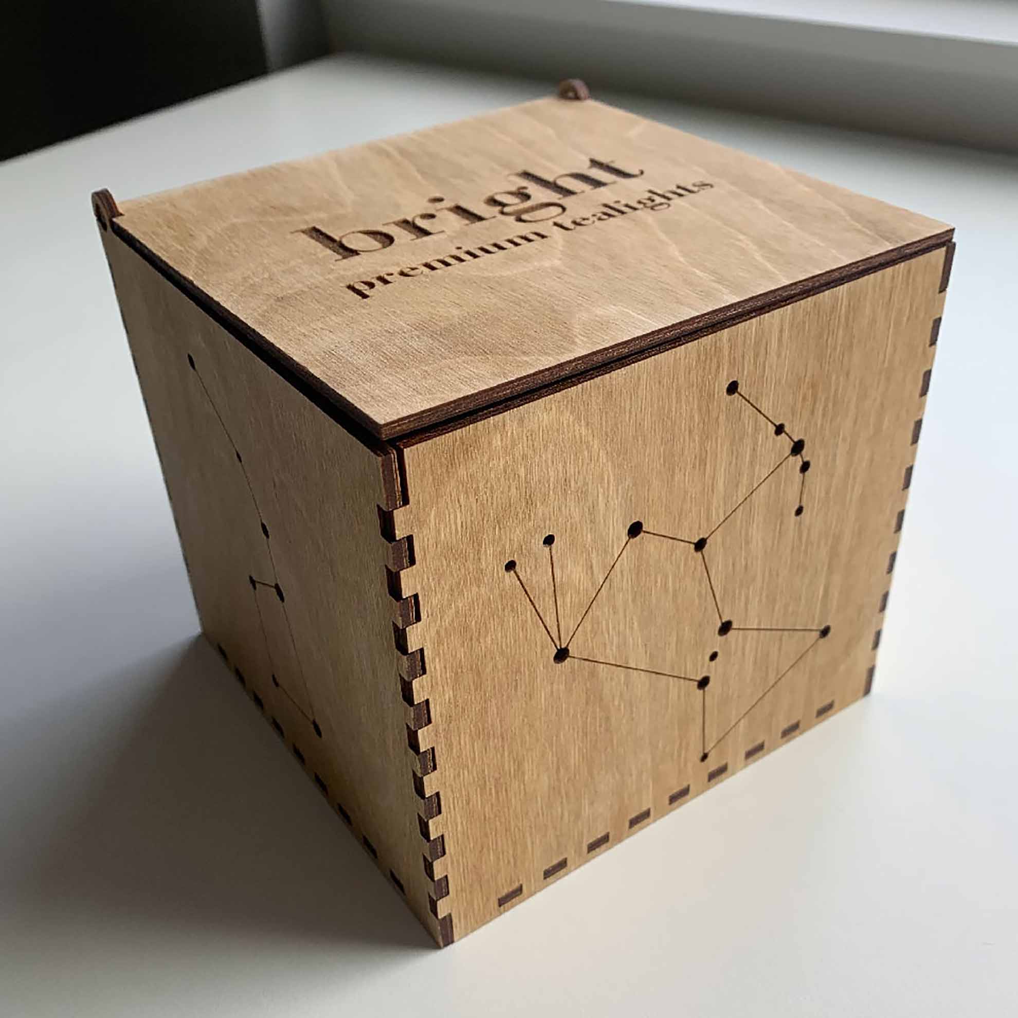
The piece was created for Graphic Design I's packaging project. The box is made entirely out of wood and was engraved with a laser cutter. The box is made to hold tealights, and when placed inside the box and lit, the holes of the constellations are projected onto walls. The main goal of the box was to make beautiful packaging that would not be tossed after the product was purchased, and by making the box essentially function as a lamp, I hope it extended the product's potential lifetime.
![]()
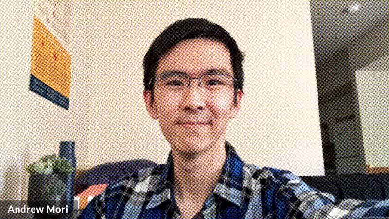
I’m Andrew, a junior in the Design and Humanities programs at Seattle University. I come from Honolulu, Hawaiʻi, where I discovered my interest for design initially through typography. As a designer, I’m often inspired by my Hawaiʻi roots, coupled with my strong desire for organization to create simple, clean, yet impactful works. Utilizing primarily print and digital mediums, I aim to convey thoughtful, compelling messages that resonate with—even challenge—society.
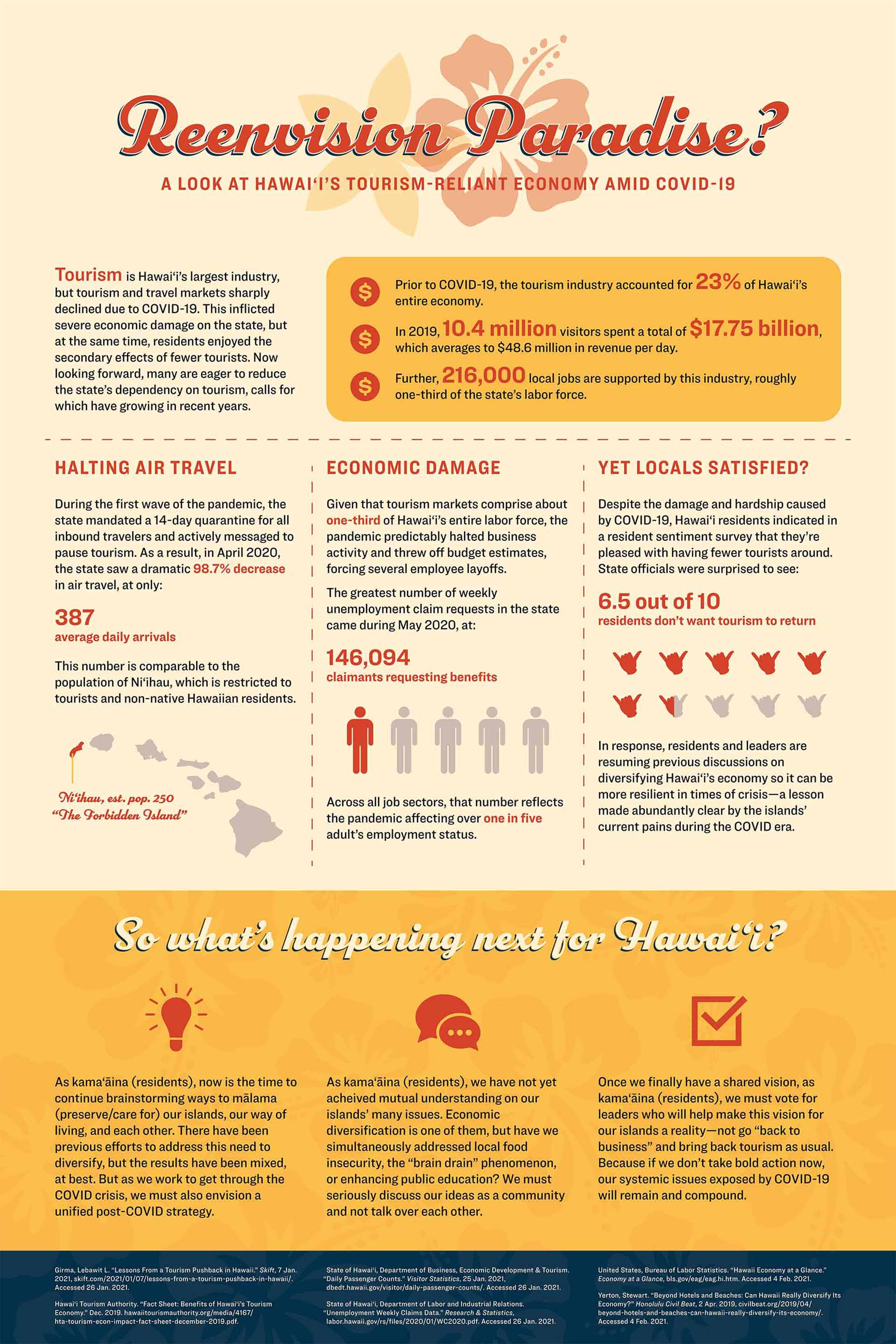
Hawaiʻi’s economy is driven primarily by tourism, so when COVID-19 prompted global lockdowns in March 2020, the state felt severe economic damage. Yet during this “pause,” many residents enjoyed having fewer tourists around, some calling for a reimagining of the tourism industry. Capturing this dynamic, I used this infographic project to research and illustrate how massive the industry was in 2019, and then how the sharp decrease in travel forced the labor force to contract. Evoking the aesthetic of vintage travel posters, this design is a call to action: to reenvision a more diversified, resilient economy and a healthier relationship with tourism.
![]()
My name is Quang Dao Phuoc Tran (Ben). Born and raised in Vietnam, I made my first steps to the United States in 2016. Experiencing different cultures has a significant impact on how I view the world and how I apply them to my works of art. I like seeing and experiencing different things when it comes to finding inspirations and I use art as a way to speak up for myself.
I have always believed that there are 2 states existing in each human being: dark and light. It is always your choice to decide which state to stay at. It is alright to drown yourself in darkness when you feel saddened or paint your own bright and colorful vision when you are happy. Either state, it's you!
![]()
I am Samrawit, but a lot of people know me as Sam! I was born and raised in Seattle though my family is originally from Eritrea. Growing up, I really enjoyed building and arts and crafts, but I didn’t think it was possible for me to make this a career path. After two years at Bellevue College as an engineer major, I transferred to SU where I started my design path and along that journey I found photography. Naturally, I’m a quiet person, so art has been a very important part of my life. It has allowed me to speak out visually when I couldn’t verbally.
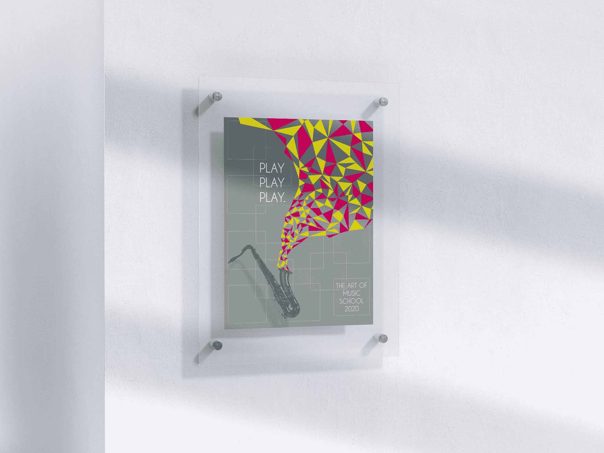
Play Play Play was a poster I recreated from scratch. The idea was to pick a poster I admired a lot and recreate it changing everything from titles, text, and images but trying to keep the essence and style of the original photo. The original poster had a mixture of patterns, realistic images, and minimal text made for a design school, so I kept that idea in mind and created a music-based poster. The idea of the triangle patterns coming out of the saxophone came to mind because of the title I picked for the poster. I wanted to emphasize on “Play” hence why everything, but the patterns are black & white.
![]()
Hello my name is Alex. I have always loved art and drawing since I was young. I love graphic design because being able to add the capabilities of computer software to the artistic ideas in your head is fun, and the possibilities are infinite.
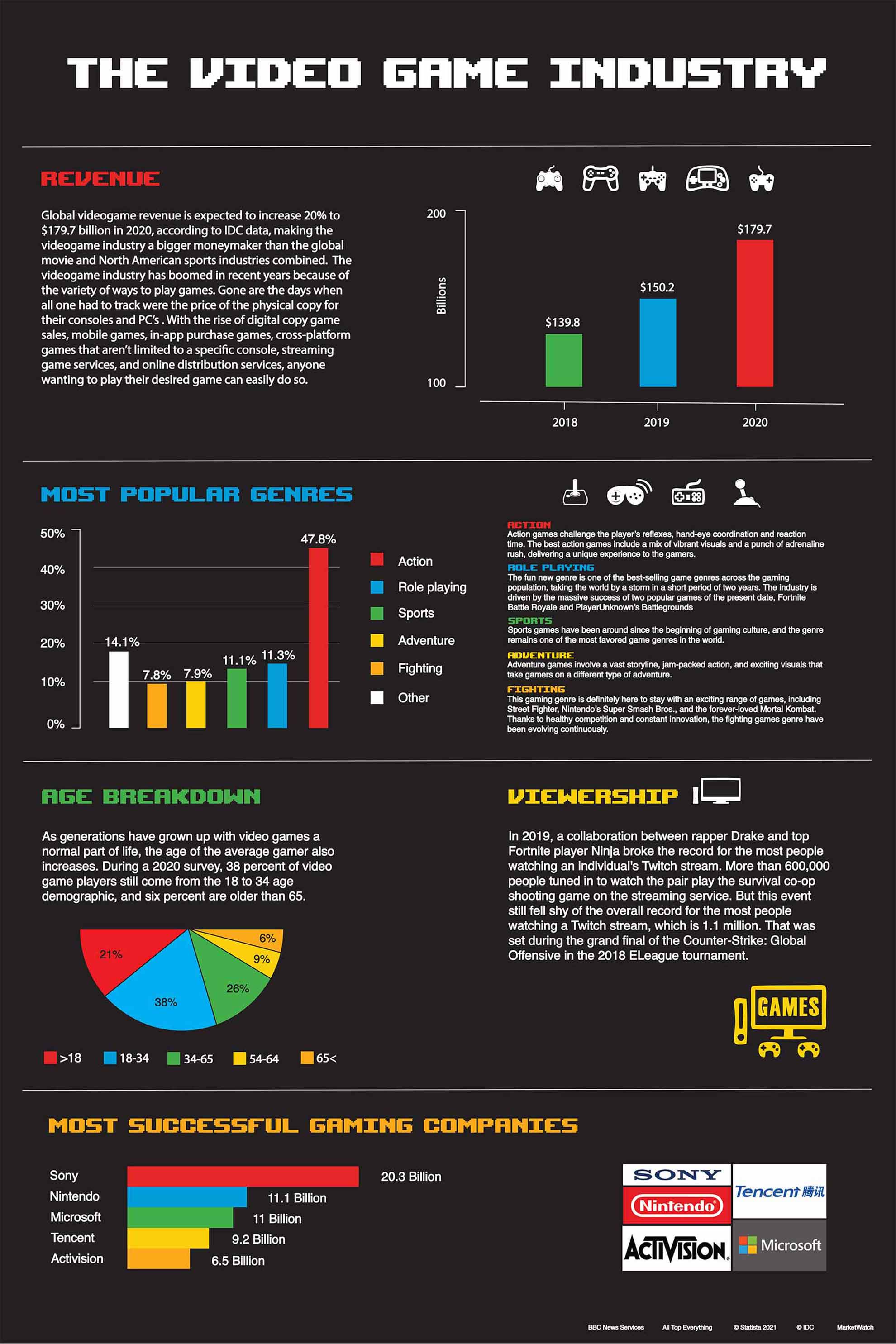
This work is about looking deeper into the video game industry and how its development and rapid growth in recent years have given video games a significant role to play in the entertainment industry today.
![]()
I am Tristan Ingalz, a soon-to-be graduate from Seattle University’s Design program. The particular style that I cater myself with is a blend of minimalism with slight eccentricity. I strive to provide clean and simple designs that focus on conveying the most important information effectively. Gaining inspiration from worldwide technology companies, I emphasize functionality among my designs to promote seamless user interaction and satisfaction to the highest degree.
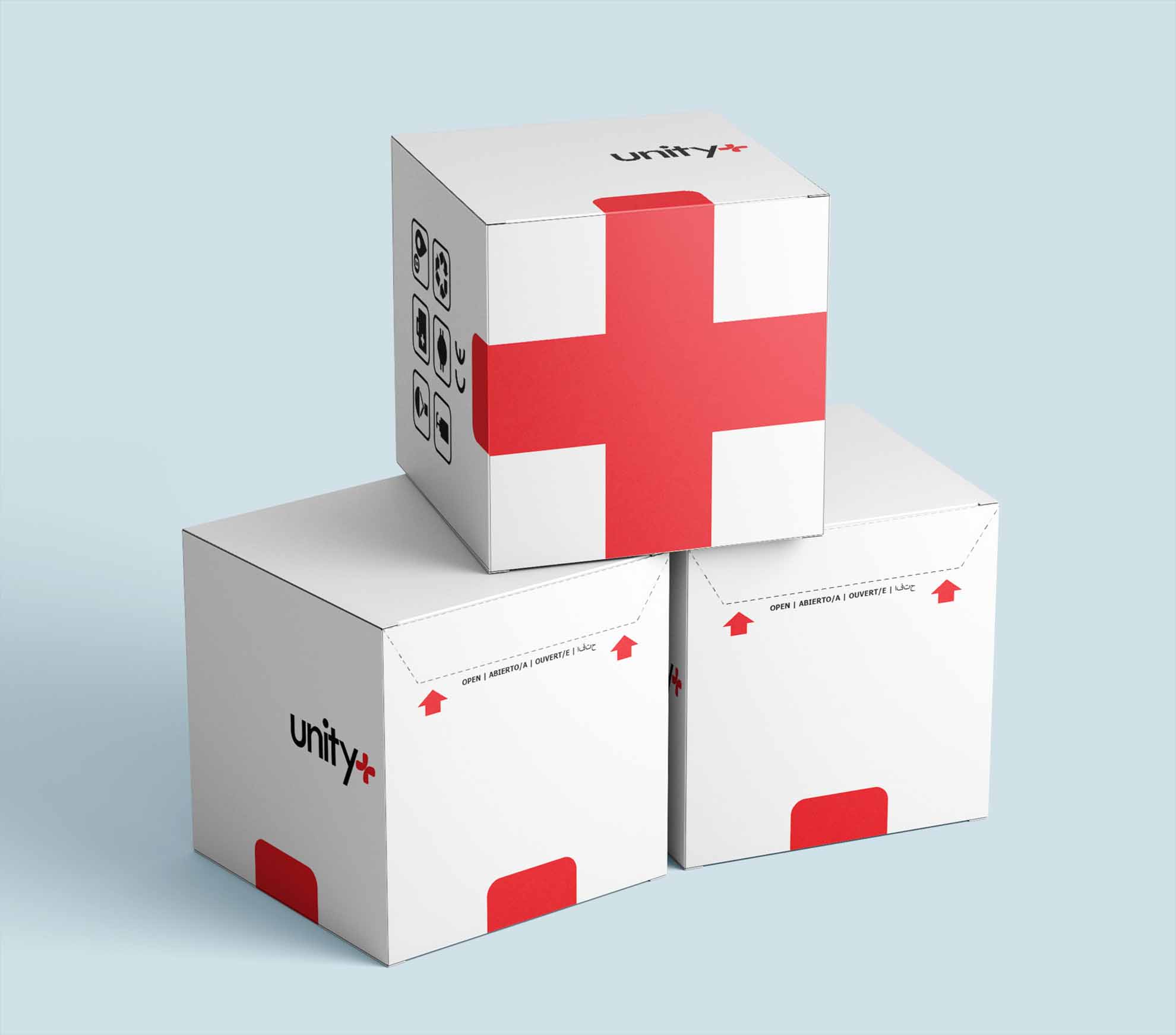
Humanitarian aid is something that can always be improved on. The most effective contemporary way to assist countries in need in a timely manner is to airdrop. With the COVID-19 Pandemic, many countries have shifted the focus of aid towards themselves rather than the world as a whole. This package is meant to be dropped and parachuted from 7,000 meters. The design itself focuses on visibility, durability, and reusability; the three issues that current methods of airdrop packaging do not address very well.
![]()
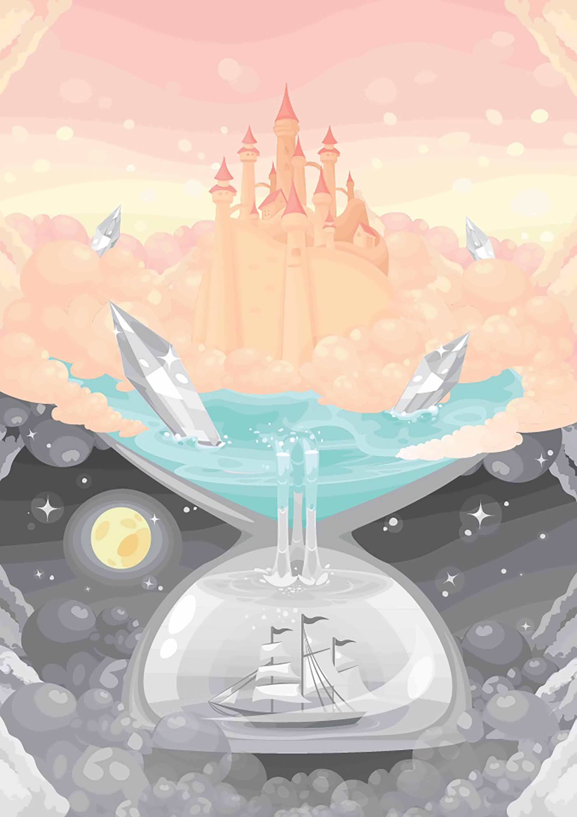
My name is Jumanah Dahi. My work intends to inspire, educate, and appreciate diversity. I enjoy creating pieces that convey cultural identity and social responsibility. I am currently learning Arabic Calligraphy and willing to use it in future projects. I believe art and design have a powerful voice in making the world a more understanding place.
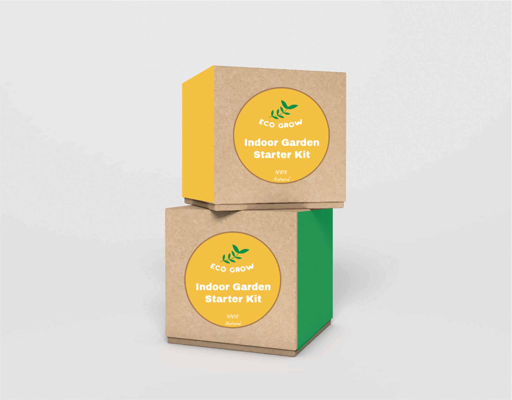
Do you need help nurturing a plant with few straightforward materials but not sure where to start? Ecogrow plant starter kit will make it easier than ever. During COVID, people tried many hobbies like cooking, working out, and even gardening. Gardening can be tricky, but with the Ecogrow starter kit, you'll find a brochure to guide you, pot, soil, seeds, and all eco-friendly materials to take care of a plant. Ecogrow is an advocacy piece that calls for action for our environmental issues. The chosen colors green(trees), mustard(land), yellow(sun) all represent the environment and our beautiful earth.
![]()
Hi, I am Cassie. I studied design and studio art in Seattle University. I am passionate about exploring the beauty in the world and putting them into art. I believe art is powerful tool that help to connect people together. My goal as a designer is to bring the beauty of art to everyone and connect everyone together.
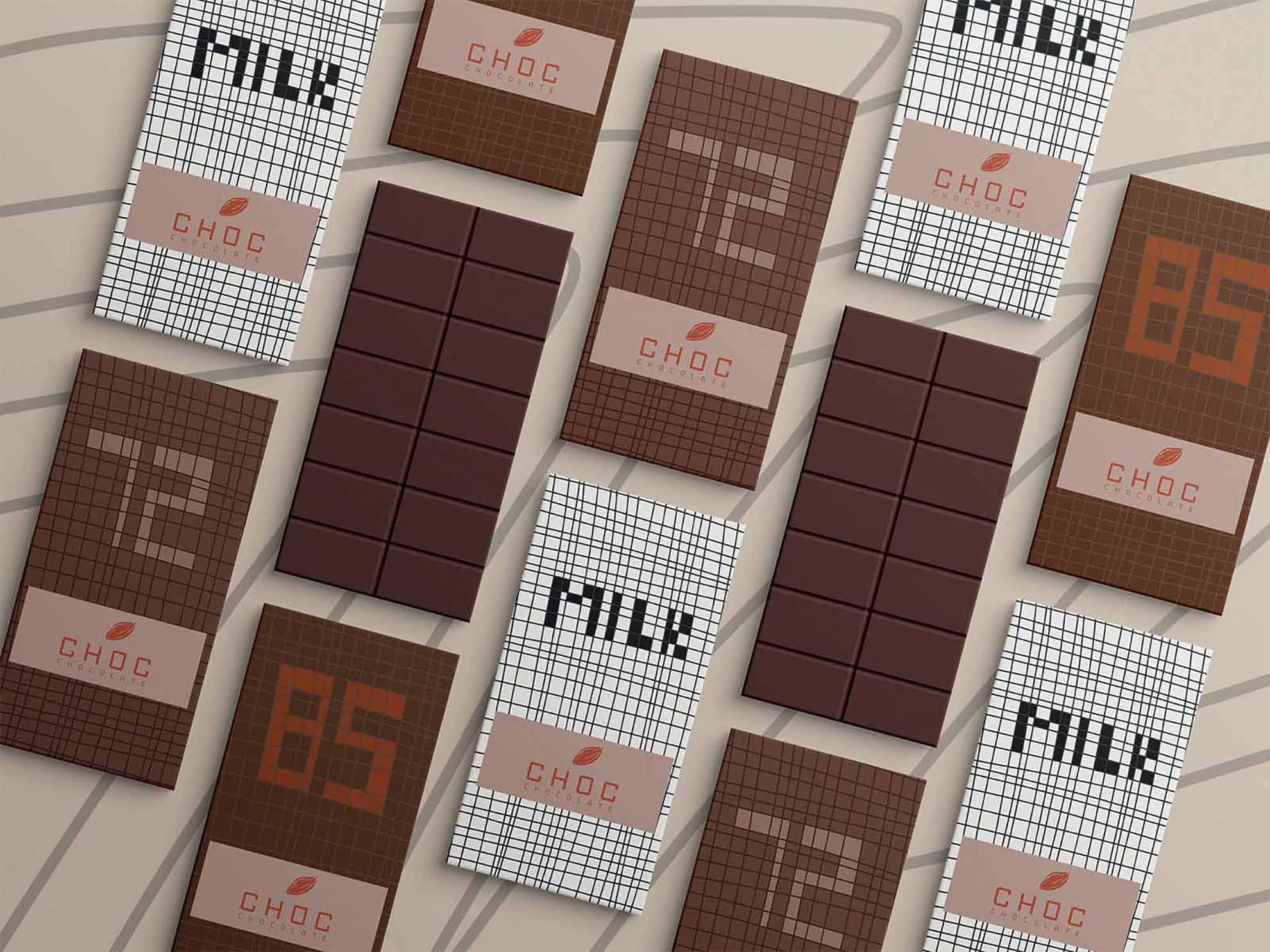
This project is a package design for chocolate. This chocolate brand will serve good quality chocolate and have the vibe of young and energetic. Enjoy the delicious chocolate with the cute wrap and some fun facts of chocolate on the inner side of the wrap at the same time.
![]()
Hello, I’m Lydia and I’m a designer based in Seattle. My focus is on UX design, brand identity, and package design. I’m drawn to design because of all of the opportunities there are for creative problem solving and making an impact on people. My motivation to design is to help create a world that is more inclusive and accessible.
The goal of YouPrint is to help make home renovation easier for the average consumer. With this project, a problem was identified, wanting to be able to see what the end result of a home renovation, and a solution was developed, YouPrint. With YouPrint, the user can use their device's camera to get the measurements of a room in their home and use those dimensions to create their dream room. All without having to spend the time, money, and energy it would usually take!
![]()
I am an artist and designer currently studying Graphic Design at Seattle University. At the core, I want my art to be a tool in exploring topics of ecology, conservation, sustainability, and environmental justice. I believe in the power of art and design to educate and inspire change, as well as a way to foster a deeper connection to both the human and non-human worlds. Breathe, stay, have a look around. I hope something speaks to you in my work - I make art for me, I make art for you. My art takes form in the sporadic, the interconnected, in subtleties and shifts. Let’s move, let’s flow!
The Mollia Mobile is a product concept that addresses waste and recycling by making an artistic home decor piece using solely repurposed plastic packaging. Only 9% of our plastic gets recycled each year - therefore, this piece has the goal of taking trash out of our waste streams and supply chains by not contributing more material and repurposing what already exists. The mobile takes inspiration from intricate and delicate coral forms, with a goal to make a bright, airy, and playful piece for a home. The product both reuses waste into something beautiful and donates back to the cause behind the mobile theme.
![]()
I'm Jayden I was born and raised in Hawaii, I believe design is a process of refinement in which something is shaved down to its most useful form, trying to maximize fun and utility is the goal for me whenever I put my mind to something.
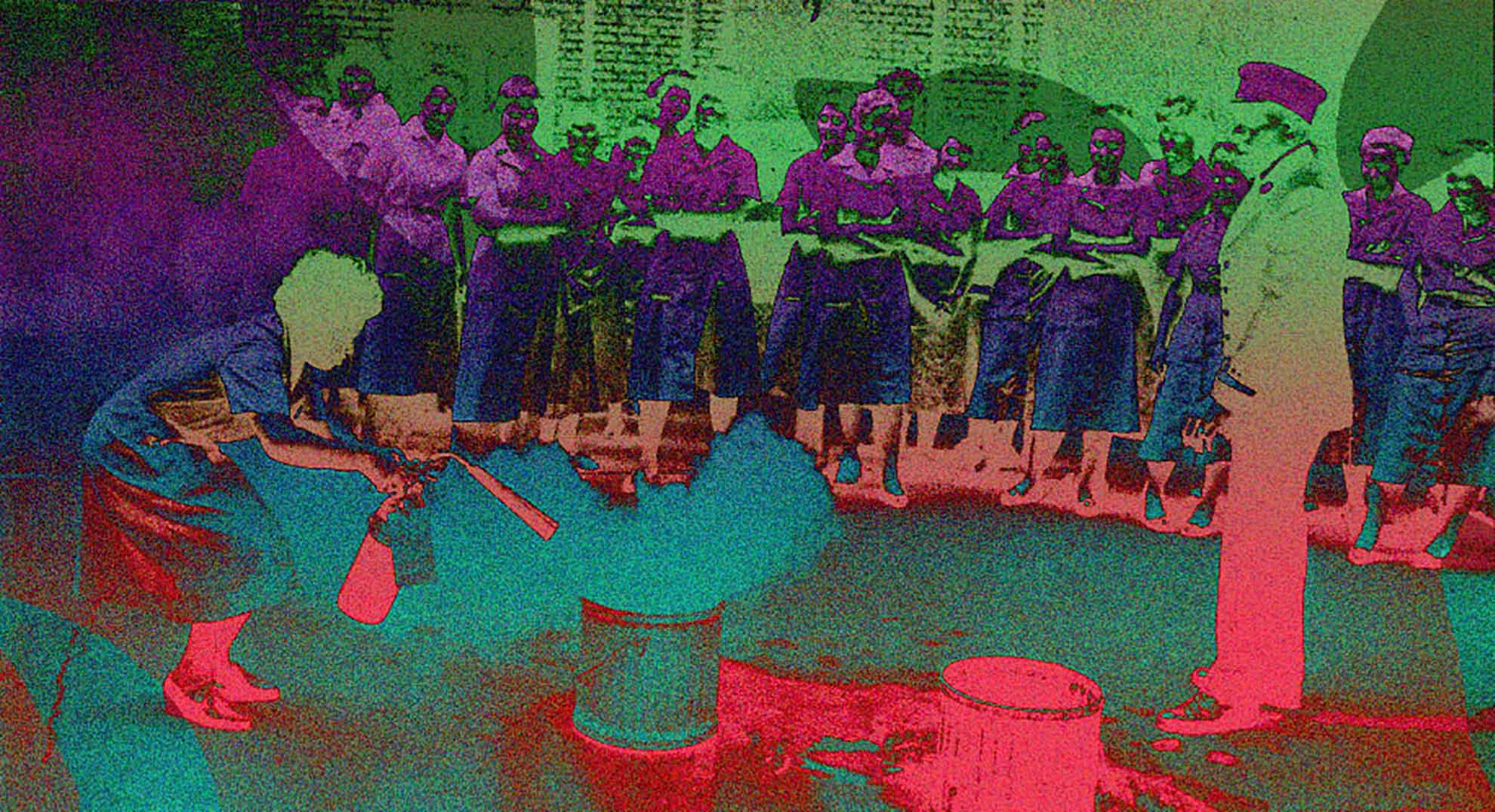
My piece is a segregation-era photo where a black woman is being trained how to put out a fire. I edited the photo to increase the feeling of otherness in the photo and tried to make the crowd seem very far and disconnect to emphasize that feeling of being alienated.
![]()
I was born in Mongolia and moved to Seattle, WA to start my journey in the graphic design field. It has been always easy for me to express myself through art in general. Making art lets me broaden my thoughts, imagination, and the way I perceive the world and others. Learning graphic design helps me express myself through my own branding and style. It lets me find out and explore my voice and personality through my designs.
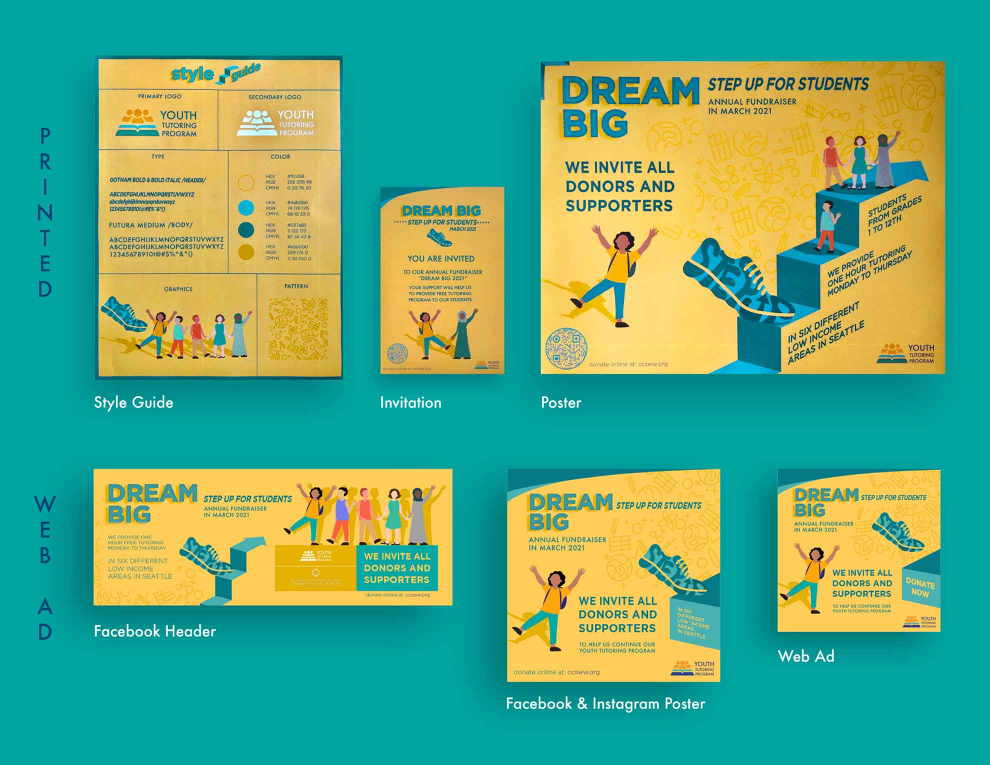 The Youth Tutoring Program (YTP) is an after-school educational enrichment program for first through twelfth-grade students who live in six low-income and public housing communities in Seattle. Started as a partnership with the Seattle Housing Authority in 1991, the tutoring centers provide youth with a safe, positive, and stimulating environment to explore learning and experience academic and personal success. They held a fundraising event "Step Up For Students" in March 2021. It was a pleasure to collaborate with this organization and make these posters. From this fundraiser, they have raised $43,000 that would support students who need support for their education.
![]()
My name is Patrick. I was born and raised in Burien Washington. I enjoy drawing, painting, paint pens, and making stickers. Much of my art is inspired by childishness and being light, loose and silly. My other passion is the outdoors. When I was a little kid, I wanted to be a marine biologist. My favorite animal is the Dungeness Crab. I enjoy letting my enjoyment of the outdoors inspire my art as well.
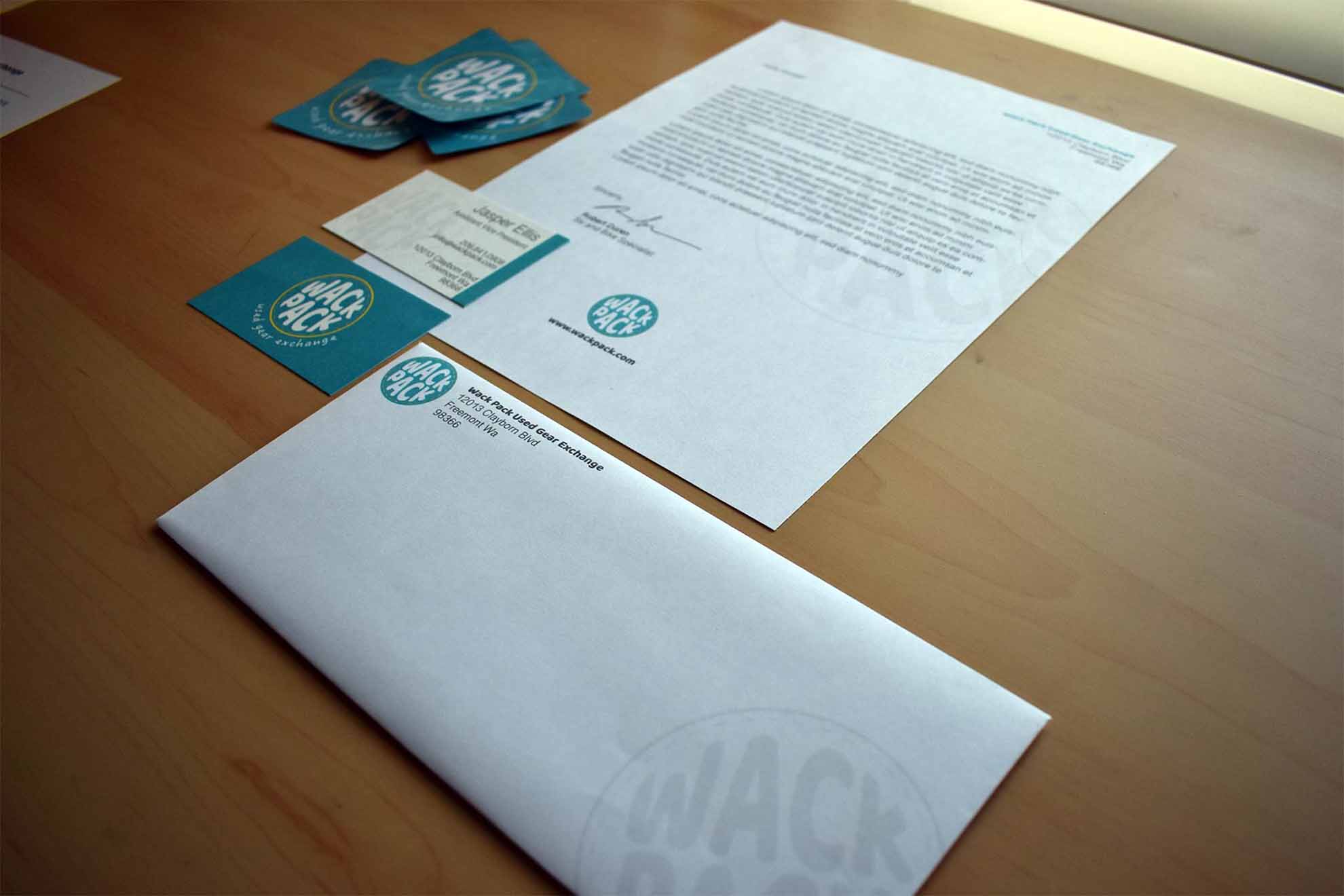
Wack Pack used gear exchange was an exercise in creating a brand from scratch. I took inspiration from companies like Wonderland gear exchange, play it again sports, and REI. The fictional company would sell used outdoor gear and clothing. Wack Pack would be focused on outdoor accessibility, the environment, and generally demystifying and trying to make the outdoor retail world fun and accessible to a larger scope of people. The name Wack Pack is obviously a play on back-pack, which feels outdoorsy. The softer colors and typeface are meant to evoke the more laidback, accessible feeling of the company. And the patch motif is meant to evoke the feeling of used gear. I was especially proud of the stickers I made.
![]()
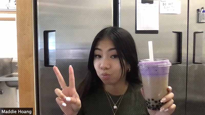
Hello! My name is Maddie and I am from Seattle, WA. Growing up, I always had an interest in art and would often experiment with different mediums. Whether it was drawing and painting, photography and videography, or sewing and sculpting, I always wanted to try new things, and still do! As a Design major, I've found different ways to utilize digital art in the real world. For example, digitizing and designing logos to be made into merchandise for businesses, such as sweatshirts, stickers, water bottles, etc. I am passionate about art and am excited to pursue a career in the design world.
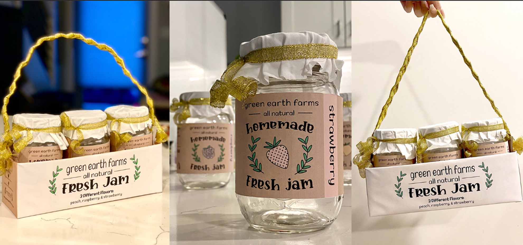
For this project, we were prompted to create a packaging design and branding identity for a product and company that does not exist yet. Around the time of this project, I was getting pretty invested in cooking and baking. I started learning how to make my own spreadable jams at home so, I decided to turn it into a product! The company name "green earth farms" is meant to capture the idea of homemade, sustainable, fresh ingredients that are all-natural. I wanted the packaging to also depict similar ideas, so I used handwritten typefaces, earthy color tones, and simple graphics.